Top ten site hoarding design tips
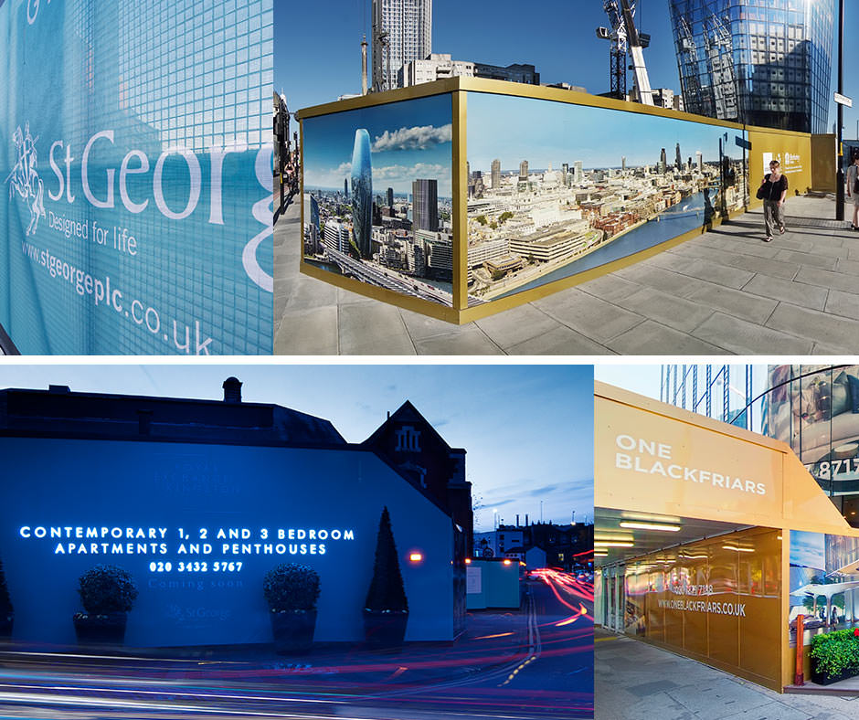
When it comes to advertising hoarding, simple messaging and bold design is the key to attracting attention and generating enquiries. We’ve put together our top ten site hoarding design tips to help you maximise awareness of your new development and boost visits to your marketing suite: 1. Establish a budget – this will help to guide your creative team from the outset and means your designers can tailor the hoarding design to make the most of your budget. It’s also important to consider which cladding you’ll use to reflect your development. Dibond cladding is ideal for most developments and vinyl wrapped ply is excellent if you want to achieve a more polished look. 2. Site survey – to make sure the hoarding fits in well with the surroundings, we recommend you have a site survey. This will consider gradients and permanent elements, using exact measurements that can be built into the design: you don’t want a web address obscured by a post box, and any horizontal designs might look messy on a hill. Make sure your survey also incorporates factors such as health and safety, wind loading and structural calculations. 3. Consider the target market – awareness of the target audience for your development will guide any imagery and graphics you select to represent your brand and help them visualise themselves in their potential new home. 4. Less is more – your key messages should pop out of the hoarding from a distance, so it’s important not to clutter hoarding and leave some space. Great images will support your brand and make sure you include key contact information and a call to action. You will need to convey messages in seconds, especially if people are driving past. 5. Brand consistency – keep hoarding design consistent with other channels and marketing, such as site signage, flags, gantry signs, your marketing suite, website or advertising. 6. Keep it fresh – refresh hoarding periodically with bold colour changes to emphasise development phases, such as plots reserved, or sales achieved. Make sure it’s kept well maintained and repaired if it suffers any damage. 7. 24/7 advertising – consider day and night-time passing traffic – both on foot or in vehicles – and make sure your hoarding design works hard at all hours and drives people to your website and marketing suite. Header and kicker LEDs can help this, as can lightboxes that showcase the décor. 8. Spotlight your logo – whether you’re a national developer or specialise in high-end bespoke builds, you need to make sure your logo is at the right scale to aid recall. As part of the design, you may consider having your logo in illuminated letters or a light box, both of which are very striking. 9. Sell the location – being sympathetic to the local area and considering the surrounding buildings when designing your hoarding is also important. Complimenting the neighborhood through your creative – whether the development is in an urban location or set within a historical market town – can help to sell what’s unique and attractive about the area. 10. Reach for the sky – standard site hoarding panels are 1220mm x 2440mm. But within your design it’s worth considering adding height at high footfall points and corners – a great way of achieving additional stand-out, especially alongside flagpoles and gantry signs. If you’d like to find out more, we have a dedicated page about building site hoarding. Please call us for a chat if you’d like to discuss a project on 01252 336 000.


