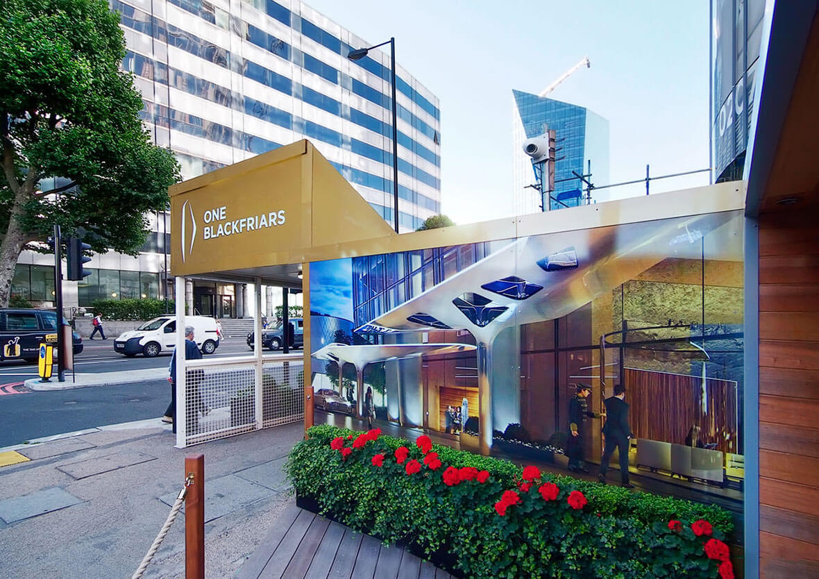
Key elements of effective hoarding design
Designing effective hoarding involves considering several key elements, and the sum of these elements contributes to its overall impact. Well-designed hoarding is effective in communicating vital information to its viewers, and it can also enhance the overall project experience. The elements for effective hoarding design: By incorporating multiple key elements, your hoarding design can become visually appealing. You can also fulfil its crucial role in delivering effective communication. We discuss the vital elements of the quality design of hoarding in the following section. Uniqueness: Uniqueness is key to making your hoarding design stand out and capture attention. Avoid generic or cookie-cutter designs and strive for a distinct visual identity. Incorporate elements that reflect the project’s purpose, brand, or location. You can use a number of creative techniques to make it stand out – including incorporating custom graphics, vibrant colours, or unique patterns for a better impact. Clarity: Clear communication is crucial in an effective hoarding design. Ensure that essential information is easily readable and easy for your potential customers to understand. Use bold typography and legible fonts because this can help convey messages concisely. Clearly display contact information and other vital information. Avoid clutter and maintain a clean, organised layout. The design should be able to direct attention to the most critical information. Visibility: Maximising the visibility of your hoarding design is essential to grab maximum attention. Consider the location and surroundings when choosing colours and materials, and use high-contrast colour combinations. This helps in enhancing visibility from a distance. You can incorporate reflective elements or lighting for enhanced visibility during nighttime. The goal is to ensure that the hoarding stands out, and the primary target is to make it easily noticeable to all. Understandability: An effective hoarding design should be easily understandable to a diverse audience. Consider the multi-cultural and multilingual aspects of the environment where the hoarding will be placed. By utilising universal symbols, icons, or pictograms you can help transcend language barriers. Your hoarding should communicate messages effectively. By using universally recognised visuals, you ensure that passersby can quickly grasp the information displayed. This plays a major role in enhancing safety and accessibility. These are some vital elements of hoarding branding and design and it’s difficult to imagine an effective design without these. If you are looking for a well-known source who can offer you all of the above when designing a hoarding, contact Reade Signs. We are a leading marketing service that understands your branding needs. To collaborate with us, visit our website today.


