Reade Blog

Indoor Signage
Wall Stickers and Vinyls

Transforming educational environments with creative wall decor

In educational settings, the physical environment can significantly impact both teaching and learning experiences. Integrating bespoke wall stickers and vinyls into schools and universities offers a dynamic way to enrich these spaces, making them more vibrant and conducive to learning. Why invest in custom wall decor? Custom wall decor, such as wall stickers and vinyls designed specifically for educational institutions, can serve multiple educational and motivational purposes. For instance, colourful, themed decor can help delineate different learning areas, such as language arts corners or science zones, creating an immersive learning experience. Moreover, incorporating inspirational quotes and educational diagrams can visually stimulate students and aid in abstract concept comprehension. Benefits for schools, colleges and universities The benefits of custom wall decor extend beyond just beautification. These elements can: Custom Design and Installation Our services encompass the entire process from design conception to installation, ensuring that each educational institution’s unique needs and visions are met. The designs are tailored to be age-appropriate and curriculum-relevant, crafted from durable materials suitable for high-traffic areas like classrooms and hallways. To see how wall stickers can transform your school or university, visit our wall stickers for schools and universities page for more information.

Read More
Wayfinding

Wayfinding: an overview of wayfinding signage

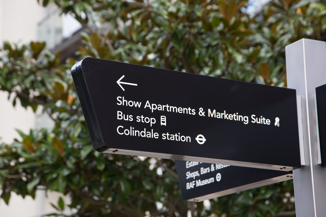
Wayfinding is a term related to navigating unfamiliar environments. It involves cognitive processes in the brain that allows us to determine our location and navigate to our desired destination. It has become increasingly important in the age of GPS and other digital navigation tools, as it helps people quickly orientate themselves and make decisions on their next course of action. Wayfinding signage is a key component of effective wayfinding, providing visual cues and directions that help users to quickly orientate themselves, reduce stress, and find the shortest route to their destination. In this blog post, we will discuss the key fundamentals of wayfinding signage and its importance in today’s world.  First and foremost, wayfinding signage serves an essential purpose: providing users with essential information about their location, as well as guidance for their desired destination. It also serves to provide reassurance that the user is indeed in the correct location, boosting confidence and reducing stress. The goal is to present this information in a clear and concise manner that is easily understandable by a wide range of users from different backgrounds. The key goal of wayfinding signage is to reduce the amount of time and effort required for a person to find their desired location.  In order for wayfinding signage to be effective, it must be designed with the user in mind. This means taking into account the needs and capabilities of a variety of users and designing the signage to meet their requirements. The wayfinding must also be visually appealing, allowing it to stand out and be easily noticed by the intended users. Additionally, the signage should guide users in the right direction with a straightforward and simple visual narrative.  The design of wayfinding signage should also focus on accessibility and be accessible to all users, regardless of physical or cognitive abilities. For example, tactile directional signage can be used to help blind users, while Braille lettering can be used to support visually impaired users. Color contrast, font size, and readability are other important design aspects to consider for wayfinding signage. Additionally, it is important to ensure that the signs encourage safe unit navigation and adhere to any applicable regulations.  In addition to its visual appeal, wayfinding signage must also communicate its intended message in a timely manner. This means that the signs should be placed in the most efficient and effective locations possible, so that the user can obtain the desired information without having to waste time searching for it.  When designed correctly, wayfinding signage can assist in creating a positive user experience, helping people to quickly orient themselves and make decisions on their next course of action. Finally, wayfinding signage also serves a purpose beyond simply guiding users to their destination. It can be used to enhance the overall user experience by highlighting features and branding that reduces stress and confusion. Through the use of wayfinding signage, users can quickly and easily gain information on their desired location, as well as the locations of other relevant amenities, such as restaurants, restrooms, parking, etc. It can also provide additional information such as local attractions, cultural highlights, and other points of interest.  In conclusion, wayfinding signage is a key component of effective wayfinding. It helps reduce the amount of time and effort required to locate a desired destination and provides essential information to the user in a clear and concise manner. It also serves to provide direction and reassurance, as well as provide a positive user experience. It is important for wayfinding signage to be designed with the user in mind, considering their needs and capabilities, as well as being visually appealing and easily readable. Additionally, signage must be placed in the most efficient and effective locations in order to communicate its intended message in a timely manner. Finally, wayfinding signage must adhere to all applicable regulations and should highlight any relevant branding, attractions, and amenities. With the correct use of wayfinding signage, the goal of effective wayfinding can be achieved.

Read More
hand holding red arrow
Signage Designs

10 questions to help ensure the success of a signage project

Whether you are considering a new sign for your business or needing to update existing signage, it’s important to ask the right questions. The answers to these questions will help you determine the best materials, design, and messaging for your sign so you can create a sign that meets your desired goal. 1. What is the purpose of the sign?  It’s important to have a clear purpose for the sign before you start planning it. Is it meant to be an attention-grabber, a brand identifier, or just simply informative? Knowing what your goals are for the sign will help you develop the design and placements best suited to achieve those goals. 2. Who is the intended audience? Identifying who your sign should target is key – if you don’t get the right message in front of the right people, your sign won’t be as effective. Who are the people that need to see the sign? Are you targeting people in the local area, potential new customers, or current customers?  3. What is the desired outcome?  Once you’ve identified your audience, it’s time to figure out what you want them to do when they look at the sign. Do you want them to call you, visit your website, visit your store, etc? Knowing this will help you create the right message for your sign. 4. What should the size be? The size of your sign should be appropriate for the area in which it will be displayed. Consider the location and the distance from which it will be viewed. Smaller sizes for up-close areas and larger sizes for further out locations. 5. What materials should be used? Choosing the materials for your sign is essential – you want something that can handle the environment it will be placed in – something that looks good and is maintainable. 6. What type of font should be used? Fonts help to transform a sign into something that makes a statement and captures your audience’s attention. Make sure to choose a font that is legible and easy to read, as well as one that accurately conveys the tone of the message you are trying to communicate. It also needs to be on brand. 7. What should the colours be? The colour of your sign is arguably just as important as the materials used and the font chosen. You should choose colours that grab the attention of your intended audience and provide enough contrast to ensure the words on the sign can be read easily. 8. Do you need any special lighting? Lighting can be a great way to draw more attention to your signage. Are there any places you can put the sign where certain types of lights like LED or fluorescent can be used to make it more visible?  9. Will the sign require any additional components? Depending on the sign you are creating, you may need to incorporate additional components such as braille, symbols, and arrows to further emphasize the message. If so, be sure to accurately represent those components with the right materials and proportions. 10. How long should the signage last? You should think about how long you want the sign to last before you decide on the materials and components used. If you are looking for something that will last for years, it is important to choose materials and components that can withstand the elements and any potential wear and tear.  Asking these questions can help you narrow down your choices and create the perfect signage, whether it’s completely new or an upgraded version of what you already have. Understanding the purpose of the sign, who it should target, what the desired outcome is, and the right materials and components to use are essential for creating high-quality, lasting signage. Talk to Reade Signs to take these basic questions to the next level, and really ensure you’re getting signage solutions that exceed your expectations.

Read More
Architectural

Benefits of wayfinding signage for businesses

Wayfinding signage refers to the system of signs and other visual cues that help people navigate through a physical space, such as a building, campus, or city. These signs can include directional signs, informational signs, and regulatory signs. Wayfinding signage is becoming increasingly important for businesses, as it can help to improve the customer experience, increase safety, and boost revenue. Here are a few key benefits of wayfinding signage for businesses: To effectively implement wayfinding signage, it’s important to work with a professional designer who has experience in creating effective wayfinding systems. They can help to identify the key areas of the business that need signs, determine the type of signs that are most appropriate, and design the signs to ensure they are clear, easy-to-read, and visually appealing. In conclusion, effective wayfinding signage can help to improve the customer experience, increase safety, and boost revenue for businesses. It’s an important aspect of creating an efficient and enjoyable environment for customers and employees, and should not be overlooked.

Read More
Case Studies

Gravesend wayfinding signage

Municipal signs pointing to the post office or the park can just be functional or they can add something to the environment. At Reade Signs we always enjoy working with local authorities who want to make public spaces more attractive while providing a public service. Gravesham Borough Council asked Reade Signs for a series of monolith signs, which feature historic images and inform the public about Gravesend’s rich historic connection with the Thames. The council wanted the monoliths to be put in place with as little fuss or disruption as possible in the run-up to Christmas. So, rather than spend weeks fencing off pedestrian areas one at a time to install the concrete foundations and signage, we did all the groundwork first, setting a custom ground cage and frame into concrete foundations at the various locations around the town. We then fitted a temporary cover plate over each one so that pedestrians could safely walk over them. The SolutionOur fitting team installed all the monoliths in one day, simply ‘plugging in’ and bolting them down into the waiting sockets so they seemed to appear overnight to the public. Not only did the plan add to the ‘wow’ factor, it also cut down inconvenience to the public and saved the council money by avoiding the need for expensive route closure licences. We also refurbished the town’s existing 11 tourist wayfinding finger-posts and added seven more with a modern sign system incorporating a beautiful finial on the top of each one in the shape of a Thames barge. The council commissioned the unique sculpture and we then developed several prototypes for a custom mounting point and corresponding base plate for all of the signs, coming up with a design that allowed the two parts to come together seamlessly. Kent County Council

Read More
Dog House Creative Workspace
Case Studies

Dog House Creative

Dog House is a unique workspace for sole traders and business owners in Reading. It’s a refurbished, Grade II listed building designed to create a surprising and inspiring environment. The building is owned by TCN, which regenerates unloved buildings and creates surprising places for people to work. The design brief was to create signage with a playful twist to complement the exposed brick finishes, wooden floors and grand staircase. Reade Signs was selected to manufacture and install the signage. Our team worked closely with the design concepts to recreate them using the right materials for the desired effect. This project included fret-cut exterior logos, vinyl logos, tenant boards, lightboxes, toilet signage, meeting room signs, directional signage, gold floor numbers, funny quotes, 3D metal effect lettering, frosted glass graphics, wall vinyls and wayfinding. The final signage is stunning and quirky and is guaranteed to put a smile on visitors’ faces!

Read More
Case Studies

Gainsborough Children’s Centre

Working with main contractor to build and install these impressive 1300mm high letters to advertise the new Children’s Centre (which is attached to the Gainsborough Primary School in Hackney). The letters were manufactured in descaled stainless Steel and stove enamelled, creating an extremely durable finish. Led illumination was built into the trough at the base of the letters so that the light washes up the letters giving them a soft glow at night. Planters built in the same material as the sign were included as part of the scope The client was delighted with the finished sign.

Read More
Museum Wayfinding
Case Studies

Victoria & Albert Museum, London

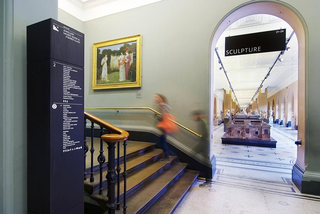
The award-winning V&A Wayfinding assignment was one of the most rewarding projects we have completed in recent years.  There were so many factors to be considered, not least the need to cause minimal disruption so that visitors and private events (which are the museums life blood) could continue. Most of the works were therefore carried out overnight and over several weeks. We worked closely with the museum’s estates team to ensure we could get the signs from one location to another and with limited storage space available on-site, staged deliveries were needed. Fixing into the walls and ceilings of one of London’s most iconic listed buildings is not for the faint hearted either, with extensive testing and sampling taking place before installation. There are over 400 signs in all, ranging from totem signs clad in black tulip wood, to projecting, wall mounted facilities signs, maps and hanging gallery signs. Each sign was fabricated by hand, with direct to media print being applied for the graphic elements, giving a durable, unbelievably sharp finish. The signage and wayfinding scheme won the coveted SEDG (Society for Experiential Graphic Design) ‘HONORS AWARD’ in 2020. Furthermore, the V&A undertakes continual visitor surveys and the results speak for themselves: 74 percent of visitors said that they found navigating easy or very easy, compared to 58 percent in the same period the prior year. The proportion of visitors answering “difficult” or “other” fell from 18 percent to just 3 percent.(Source V&A)

Read More
Case Studies

Sugar House Island

We were tasked with manufacturing and installing the 1.5 mtr high letters and logo on the top of No. 1 Sugar House Lane, the gateway to the new Sugar House Island development by international developer Vastint. Before the final letters could be manufactured we produced a full size sample and secured it in position on the roof so that the stake holders could view it from all angles and approve for production. Finally, the huge letters, with Cabochon lighting were fixed directly into the building’s steel work and cleverly designed by our team to hinge backwards to allow maintenance from the roof.  Dominating the skyline from the High Street, Stratford, they create a lasting landmark within the local area. The Logo and Visual Identity were designed by Kurz Gestaltung, Berlin.

Read More
Case Studies

London Estate Agents Office Renovation

The Reade Signs’ team enjoyed this exciting project of transforming an average looking office into a dazzling workspace that would excite and inspire staff and clients alike The Brief To produce stand-out graphics to dress the walls at the London Cityzen office not only to create that wow-factor, but to also disguise any structural defects and irregularities of the building, including undulating walls and boxed in areas prone to damp. The Solution Using images chosen by the client, and in line with their brand guidelines, Reade Signs designed a wall cladding on brushed stainless steel and ebony using full colour images. This required a lot of bespoke modelling of the clad to accommodate the unevenness of the walls, but the pictures speak for themselves! The results are outstanding. Reade Signs’ experienced and dedicated team created this modern, inspiring and exciting environment and enabled Cityzen’s vision to become a reality. “We employed Reade Signs to re-design our office. The end result was exactly what we were after and we often get compliments on our office from clients and passers-by. I wouldn’t hesitate in recommending Reade Signs to anyone and in fact we have used them again recently to create logos for our company cars.” Warren Black, Co-Founder, Cityzen

Read More