Reade Blog

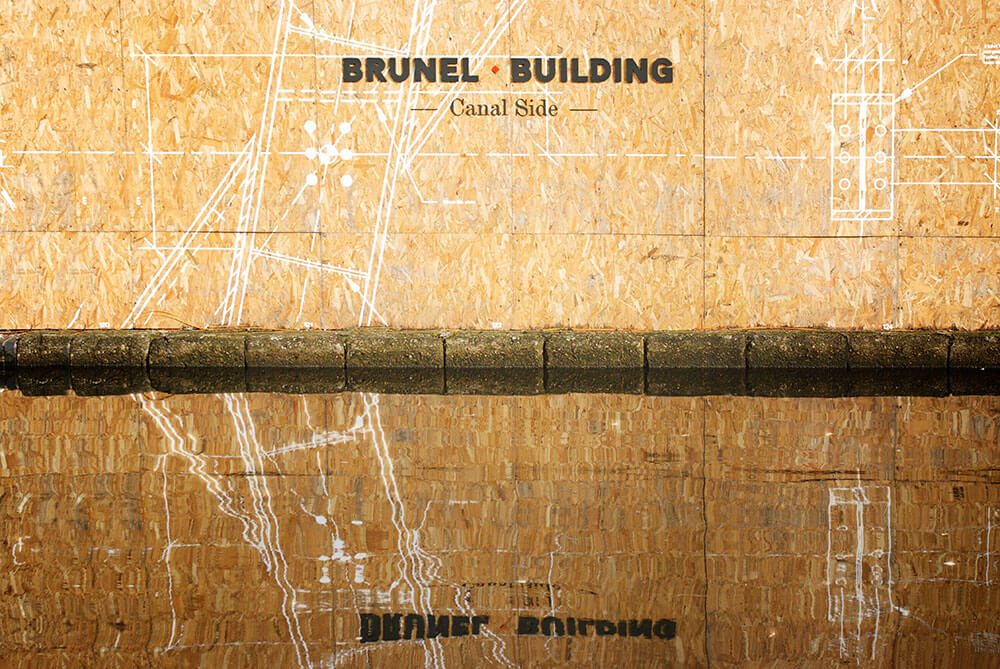
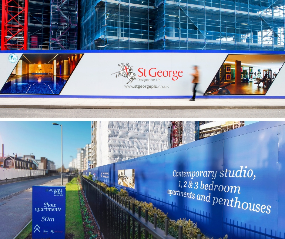
Beaufort Park site hoarding
Property

What is the lead-time for hoarding?

Commissioning advertising hoarding panels often gets left until the last minute, but you can get the most value and impact by considering your hoarding cladding design and materials as early as possible to make the most of the pre-launch window. Allowing for different milestones such as ‘site acquired’, ‘under construction’ or ‘plots reserved’ throughout the life-cycle of the build can engage the community and build interest from the outset. Advertising hoarding panels are a superb way of generating valuable word-of-mouth advertising in the local area, selling the future vision of the development and driving marketing suite visitors. Turnaround time for site hoarding will very much depend on the size of the hoarding project, but from final artwork, our average lead-time to manufacture, print and install 20 metres of hoarding panels in a single location is just three days. Before you get to final artwork stage, we take the initial briefing and come up with recommendations for potential materials, styling and lighting options. We conduct a professional site survey and then agree the final design – either with our in-house team or with the client’s designers. It’s important to look at creative solutions for your budget, make clever use of manufacturing techniques and position key messages at high footfall points to maximise stand out. Leaving enough time means you can take these elements into consideration and create hoarding that stands-out. Find out more about building site hoarding on this dedicated page. If you’d like to discuss a project, please call us on 01252 336 000.

Read More
Hoarding – top tips for being bold on a budget
Property

Hoarding – Top tips for being bold on a budget

Every new residential or commercial development is different and requires tailored marketing to attract different audiences. But what are your options with advertising hoarding if your budgets have been squeezed, but you still want to make a big impact? Here are a few solutions we recommend… I love the look of built up letters but don’t have the budget for stainless steel: Instead of fabricated built-up stainless-steel letters, we suggest 20mm thick painted Foamex letters to highlight the development name. Brass letters would set off my high-end development, but the costs are prohibitive: Instead of using expensive metal materials – we can create metallic text in bronze or gold-cut vinyl to achieve a high-end effect. The designer’s hoarding concept uses a spot-UV effect we love, but we can’t justify the additional cost: Using a combination of matt and gloss laminate creates a superb spot-UV effect. There are a huge number of competitors in the local area, and I want to stand out above the traffic: Extra height sections of hoarding manufactured in Foamex are a great, low cost way to maximise impact at key footfall points and above the height of the traffic. I want people to look twice: Using different depths of hoarding can create an effective look – by building out parts of the hoarding or creating recesses, you can add interest. I’m looking for a cost-effective industrial look and feel: Vinyl applied on sterling board with Foamex built-up letters gives an original, contemporary industrial effect. There are so many options and our team are great at coming up with creative solutions to suit any budget. Find out more about building site hoarding on this dedicated page. If you’d like to discuss a project, please call and speak to one of our hoarding experts on 01252 336 000.

Read More
Which hoarding is best for your housing development
Property

Which hoarding is best for your housing development?

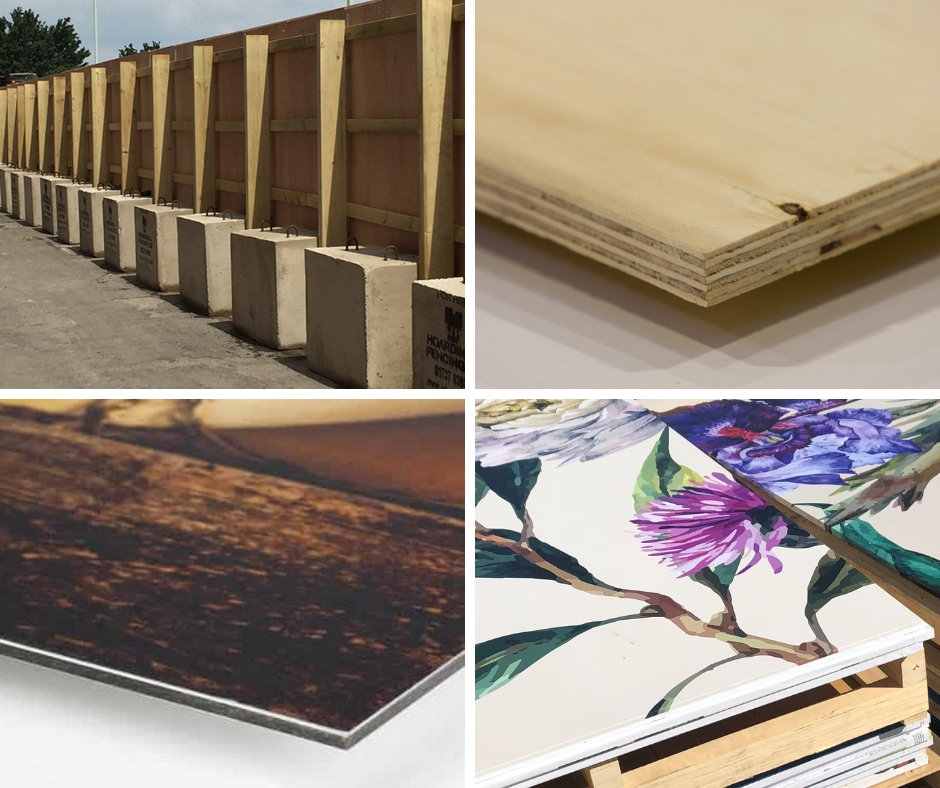
Hoarding is a temporary structure installed around the perimeter of a construction site for the safety and security of the site, construction workers and members of the public. It’s also a highly cost-effective advertising space to showcase a housing or commercial development, communicate the brand and attract sales. For advertising hoarding, we recommend cladding the base ply hoarding panels with either digitally printed Aluminium Composite Material (ACM) or a direct vinyl wrap to the ply*. Both options will carry your message and images in high resolution full colour digital print and images can even be illuminated. We recommend headers and kickers be added to give a neat finish and again these will allow for lighting to be fitted beneath the header, which will provide a wash of light to illuminate the entire hoarding at night. They suit both short and long-term use and are easy to install, strong and secure. Which material is best for my hoarding project? ACM sheets – also commonly known by the brand Dibond, ACM is secured onto plywood. It’s made from two thin coil-coated aluminium sheets bonded to a non-aluminium core (polyethylene or foam). Printed ACM can be applied straight onto hoardings. It’s a superb material for hoarding because it flexes and is very durable, offers sound reduction and is fireproof. The overall affect is a streamlined, professional look and feel. Individual panels can also be easily updated and replaced and is less expensive than vinyl wrapped ply. Vinyl wrapped ply hoarding panels – comes with different effects and can be laminated or wrap sealed. Vinyl wrapped hoarding is popular with luxury, high-end building developments. This type of hoarding gives a very high quality of finish. Site hoarding lasts for about three years, although it can be updated and refreshed at any point during the build. For extra longevity, hoarding can be coated with anti-graffiti laminate. Our team takes a consultative approach and can provide advice on the best option for your development, based on the brand, location, site life-cycle and expected frequency of message changes. Find out more about building site hoarding. If you’d like to discuss a project, please give us a call on 01252 336 000. *Vinyl wrap to ply requires a specific grade of ply, please ask for further details.

Read More
Company News

From apprentice to award-winner: celebrating young talent in the UK sign industry

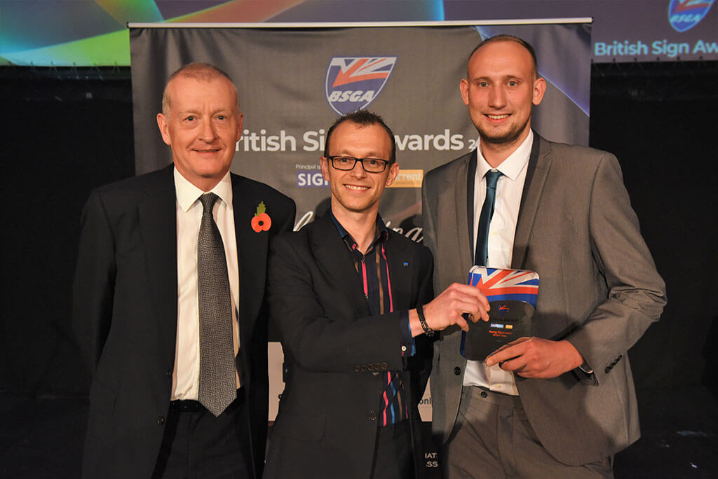
Last week I made my way to Leicester with my colleague Marc Kisko to attend the British Sign Awards 2018. The awards celebrate some truly remarkable achievements that demonstrate the wealth of skills and creativity that make the British sign industry world class. Marc, who is 22 and has been with Reade Signs for four years, was shortlisted for the Young Sign Maker of the Year category. And I’m absolutely thrilled that he won the award! From the outset, Marc has shown dedication; he completed his apprenticeship in 12 months – instead of the usual 18 – and demonstrated real development and problem-solving skills ever since. This approach has continued throughout Marc’s time at Reade Signs. It is his attitude that really drives him forward. Marc is a naturally quiet and reserved person, so it’s understandable that coming in to join an established team might be daunting. However, Marc has really demonstrated a thirst for knowledge, a drive for personal development and he works brilliantly as part of our team. Marc has continued to learn and recently trained to use our state-of-the-art EFI Vutek LX3 Pro printer. Amira Bouchiba from CMYUK, who trained Marc told us: “Marc has been what I would call ‘the perfect student’… although he was not my only trainee, Marc stood out.” Since qualifying, he’s really made this his mission and pushed himself ahead. This epitomises the drive and flexibility that has been at the core of the growth of Reade Signs and our founder, Andy Reade’s philosophy since he started his career as an apprentice sign writer. Marc recently met MP, Leo Docherty, who visited us to learn more about Reade Signs and how we develop apprentices. Marc’s younger brother Kyle has also completed his Sign Makers apprenticeship with us, and our Assistant Account Manager, Jerome True has recently finished his Business Administration apprenticeship. I’ve been thrilled by the rapid progress made by Marc. He’s just got his head down and got on with it. He is very conscientious and a pleasure to work with. Congratulations from all of us at Reade Signs! “The Young Signmaker of the Year award is designed to highlight how vital training and apprenticeships are to the sign industry. Young people are the future of the industry and unless we provide them with the right training, the industry will struggle in the years to come. This year, we had a record entry for the award, demonstrating that enlightened companies continue to invest in young people, but it is essential that more sign businesses follow their lead. Our congratulations to Marc and to Reade Signs for showing the way.” David Catanach, BSGA Director.

Read More
Property

A guide to cost-effective advertising hoarding for new developments

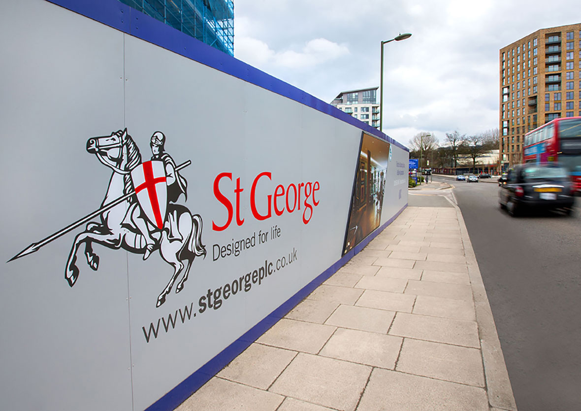
Building site hoarding is essential to keep both construction site workers and members of the public safe. It’s also one of the most cost-effective advertising spaces for your new housing development and vital to drive marketing suite visits, enquiries and build a database of interest pre-launch. If you are responsible for marketing, you’ll no doubt be looking across multiple channels at the most cost-effective ways to raise awareness of your new development. Advertising hoarding panels are a superb communications channel since they are exceptionally good value. A 48-sheet advertising billboard is likely to cost over £1,000 for a month’s advertising spot. Whereas, the equivalent hoarding in square metres will cost around half that price. When you consider that hoarding could be in place for 12 months or more, the comparable savings are easily more than £10,000! Additionally, you can also refresh your hoarding panels in that time and adapt messaging based on interest and sales, or even advertise other developments and still make significant savings. Making the most of your hoarding space One of the key elements to get right is a professional site survey as this ensures messages work across numerous panels, which may have to be professionally installed at a gradient or around street furniture. To maximise advertising hoarding and build awareness, make sure your design keeps to the development’s brand and incorporates bold colours, striking graphics and photography. Keep your hoarding design simple; you can say so much with a visual. Consider the best places for your messaging, taking into account the sizing of text for pedestrians and passing traffic. As a rule-of-thumb, one great image, a short headline of five to seven words, a call to action and your logo is ideal. Find out more about building site hoarding on this dedicated page. If you’d like to discuss a project, please give us a call on 01252 336 000.

Read More
Architectural

Wayfinding project wins global SEGD award

A project that we supplied and installed over 300 separate vinyl and painted wall graphics for has been awarded a Merit Award for wayfinding in the prestigious SEGD Global Design Awards 2018. The vinyl and wall graphics of varying sizes were created for Here East. Spread over two huge buildings at the former press and broadcast centres of the Queen Elizabeth Olympic Park in Hackney Wick, it is now a thriving space that offers state-of-the-art facilities in an awe-inspiring environment. We worked with brand and design consultancy dn&co, who created a wayfinding system to navigate the 1.2 million sq ft, to fabricate and install the inspiring and intuitive wayfinding. Find out more about the Here East wayfinding project.

Read More
Property

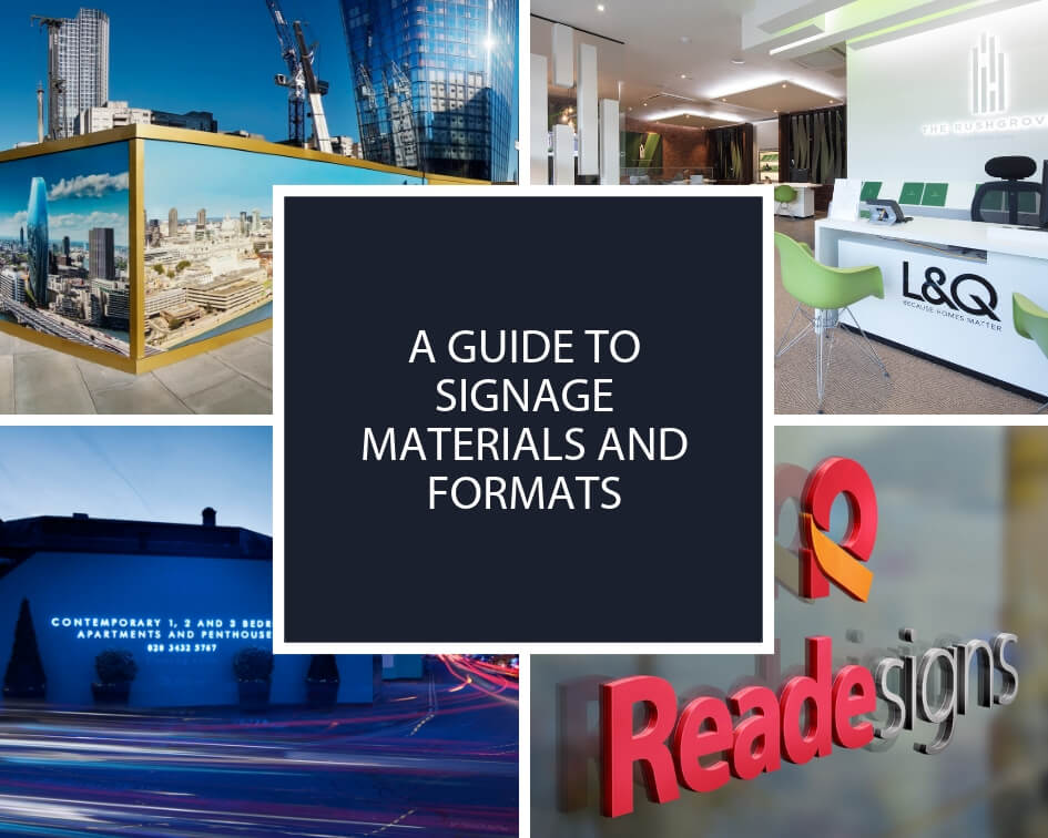
A guide to signage materials and formats

Signage can be created using a wide range of materials and formats that all deliver different effects and make brands shine and messages pop out. We work with clients right from the start of each project to consult on how to bring designs to life.  Please get in touch if you have any questions or a project in mind. Here’s a little taster of the different materials and formats on offer: ACM clad – This stands for Aluminium Composite Material, but is also commonly known by the brand, Dibond. It’s made from two thin coil-coated aluminium sheets bonded to a non-aluminium core (polyethylene or foam). Printed ACM can be applied straight onto site hoarding to promote new developments, while adhering to health and safety regulations. It’s a superb material for hoarding because it flexes and is very durable, offers sound reduction and is fireproof. The overall affect is a streamlined, contemporary look and feel. Acrylic – Perspex® is a well-known brand of acrylic sheeting. It is a tough, transparent, versatile thermoplastic used in many applications, particularly in visual communications, design and architecture. Acrylic is very resistant to shock, flexing, scratching and weathering. It comes in many colours and finishes and is totally recyclable. We apply acrylic shapes to hoardings to bring them to life, as well as for use in general signs and wall installations. It can be sprayed in different colours and makes brand logos stand out. We often use it self-coloured or reverse printed acrylic for stand-up letters, CGI pictures on hoardings and building exteriors. Aluminium – A strong, light metal used widely in industry, aluminium is the most abundant metal on the planet. It’s malleable, so it’s easy to make into whatever shape we need, and it’s resistant to corrosion. We use aluminium for architectural features and walls, fingerposts, desk receptions, built-up letters and extrusions for banner frames. Correx – Also known as fluted, or corrugated, polypropylene board, Correx is an inexpensive and efficient way to produce temporary signs or displays. Tough and lightweight, it’s easily cut to shape and comes in any number of colours and thicknesses. Correx is fully recyclable and is used a lot for outdoor signs such as estate agents’ boards. Films and finishing – The effectiveness of our products is down to the materials and the finish we give them. Whether they need to weather gracefully to blend into a historic or rural environment or endure harsh conditions, the surface layer needs to do its job. The vinyl film or laminates that goes over our hoardings add to their longevity. Foamex – A versatile, lightweight PVC foam sheet, that’s durable and easy to cut and shape. Foamex also has low water absorption, making it suitable for indoor and outdoor use. It comes in a range of colours and is a popular material for signage and displays. We can print directly on to foamex and it can be sprayed in different colours. We like to apply it to hoarding to bring it to life, adding a stand-out, 3D affect. We’ve even created an entire Santa’s grotto from foamex! Glass – A hard but brittle fusion of sand, soda and lime, we’re surrounded by the many applications of glass and we use this canvas to apply graphics for signage and marketing purposes. We can create messaging on glass for marketing suites, using frosted messages, and apply crystal edge window manifestations to make subdivisions of internal spaces clearly visible. Glass signage is also good for external architectural projects and we supply optically clear vinyl for windows. Toughened, low-iron glass is extra clear, noted for its higher light transmittance and reduced green tint. This glass is used with wayfinding architectural signage where information may change. Graffiti proofing – We can apply a special anti-graffiti laminate seal to hoarding and signs to ensure they last. This is a special coating that makes it easier to clean your signage if it’s vandalised. Green walls – Also known as a living wall, this is a vertical surface partially or completely covered with living greenery, complete with a growing medium and integrated watering system for interior spaces. Green walls are great especially if your external or internal space has a green and environmental theme. Lighting – Signage can work for you 24-hours a day if it’s illuminated well. Here are some of the methods we use to spotlight your brand: Illuminated lettering and lightboxes – These are additional ways to light up a hoarding and highlight your key selling points. Internally illuminated, they’re hard to miss, especially at night, and colours look bright and crisp. Lightboxes, with opal acrylic inlays for exceptional illumination, can be single or double sided, wall mounted, projecting, hanging or free standing. We can even fit them to site hoarding, which we rout out and light up from behind. LED, ribbon or strip lighting – A flexible product, this can have self-adhesive backing for use on any surface. We use this lighting in the headers and kickers of hoarding, to accent the design and draw attention to key elements, rather than trying to light up the whole hoarding. Neon – These are luminous, gas-discharge tubes that contain inert gases, usually neon. Neon lighting can light up your logo or wayfinding signage in a bright and colourful way. Neon has a classic, retro look but we’ve also used it to add urban chic ambience to an ultra-modern setting. Powder coating – This is applying paint in dry powder form to a metal surface, using a spray gun. The powder bonds electrostatically to the surface and then it’s heat treated to produce a tough coating that looks like a traditional liquid paint finish, but it doesn’t run and it’s more environmentally friendly. Powder coating is good on wayfinding signage because it’s both protective and decorative. Printed manifestations and digital wallpaper – These are large-scale printed materials applied to walls, glass and even floors. They act like murals and can be used to add any design to your interior. Digital wallpaper – or super graphics – is artwork printed onto large areas to transform office walls, whether to
Read More
Property

Bitton Mill: Transforming a tired old portable office into a fresh, new marketing suite

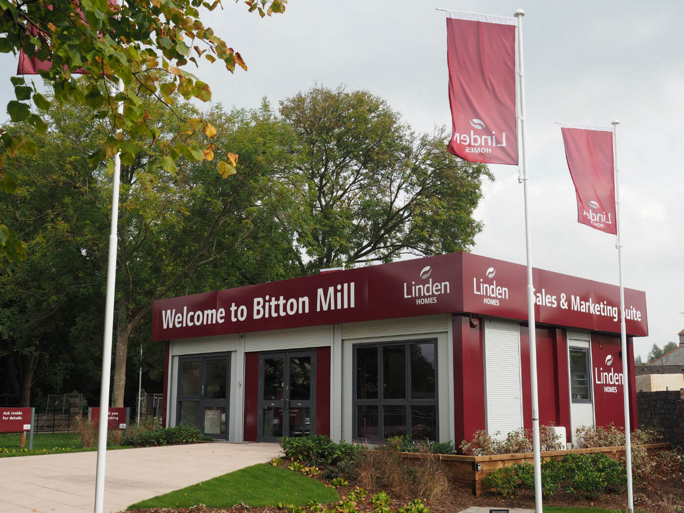
How do you clean up a tired old cabin and make it into somewhere you can sell properties to customers? That’s the challenge Reade Signs was set by a housing developer near Bristol. The objective Bitton Mill is a development of two, three and four bedroom homes by Linden Homes. For the site’s sales arena, the developers wanted to re-use a marketing suite and they wanted us to re-brand it with suitable sales signage. The challenges The problem was the cabin had been in storage for some time and was in a very poor state. There were existing graphics and a damaged fascia on the outside and that had all seen better days and its interior needed a major makeover too. On top of that, the site was also going to be a challenge, with restricted access and a very confined workspace. To get the job done, we would have to work around other trades in an area that was also the only access to the site for the large construction vehicles we regularly found queuing up through our work area. It was obvious from the start that we were going to have to be very flexible in our approach to this job if we were to achieve the desired finish on time and in a cost-effective way. Our solution Working with the client, we identified the best locations for the sales signage and decided on a complete refurbishment of the exterior, including a new fascia. We carried out a detailed survey which quickly identified that we’d need to dress the entire cabin exterior and replace the fascia while we could still gain safe access. We wanted to get the majority of the exterior signage in before the landscapers arrived, but even this plan was fraught with problems; we had to work around drainage works in front of the cabin and the delivery of a generator blocked our access to one side of the cabin for a while. Despite several other delays that were out of our control, we stripped off the old signage and fascia, measured up and designed a whole new look to the exterior, following Linden’s branding guidelines. We then decorated the interior, again in the approved Linden style and the external signage installed. One more challenge As a result of the various delays and access problems slowing us down, we faced one last problem: we had to install the external signage after the landscapers had already laid the garden, which was to be a distinctive feature for this sales area. o our team had to “tiptoe through the tulips” to ensure damaged limitation during installation. Working with the other trades on site, we made sure this was all done while sticking to our health and safety standards. Cooperation, communication and flexibility: the key to a successful delivery On projects like this it’s vital to build good working relationships, not only with the client but with other trades on site. We had to time our production and installation very carefully and stay flexible so that when the unexpected happens we were able to cope. The whole Reade team made the launch of our new development the smootest we have ever had. They reacted immediately to any technical issues on the site and always had solutions. The results are stunning and I can’t wait for the next launch! Sarah Hembrow, Marketing Manager, Linden Homes Western Reade Signs showed yet again that they are experts in this field and the results speak for themselves. If you’d like to find out how we can help you by designing and installing effective marketing signage in the most challenging conditions, then please contact us or ring 01252 336000. We’ll also be exhibiting at London Build, at Olympia on 25-26th October 2017. We’re in the Interiors Zone on stand N30 at London’s leading construction exhibition.

Read More
Property

Reade Signs pull off a tight turnaround for a world BMX champion

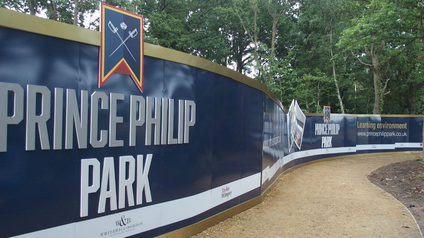
It always feels good to get involved in a new and positive development that could transform a town and its inhabitants, and our work at Bordon’s new skate park allowed us to do just that. We may have even played a small part to inspire a new generation of Olympic champions by helping to promote this fantastic new facility for young people, built on the site of a former Army barracks. Whitehill and Bordon Regeneration Company commissioned Reade Signs to design, manufacture and install 200 metres of hoarding for Prince Philip Park at Budd’s Lane, for its official opening by the Mayor, Councillor Colin Leech and Team GB Olympian, World and European BMX champion Liam Philips. The development is part of a plan to transform Whitehill and Bordon with a new town centre, leisure facilities and 2,400 sustainable homes. As is often the case, we had very little notice for the job but, as usual, we delivered on time. We were briefed to design the hoarding using specific logos, CGI’s, strap lines and pictures. We also wanted to make this hoarding really stand out and make it look a bit different from the others already in and around Bordon as part of the town’s redevelopment. This meant a real joint effort by everyone at Reade to get the job done on time: studio, project managers and even our MD got together to come up with ideas in the short timeframe we had. We decided to combine the standard ACM hoarding with 19 mm Foamex printed logos and pictures, making them all stand off and, in some cases, above the hoarding to give it the right feel. With a launch date now only 5 days away, we had many of our fitting crews on site for long hours to make sure the project was completed in time, but at the end of July, we were pleased that everything was in place and looked great for Liam’s visit, which drew hundreds of locals to the park’s opening ceremony. Reade Signs are looking forward to producing a further 200 metres of hoarding for the next stage of Whitehill and Bordon Regeneration’s development in the coming months. If you’d like to know more about how Reade Signs can help you promote an event or a new public facility then please contact us at Reade Signs or call 01252 336000.

Read More
Architectural

An overnight sensation for Gravesend

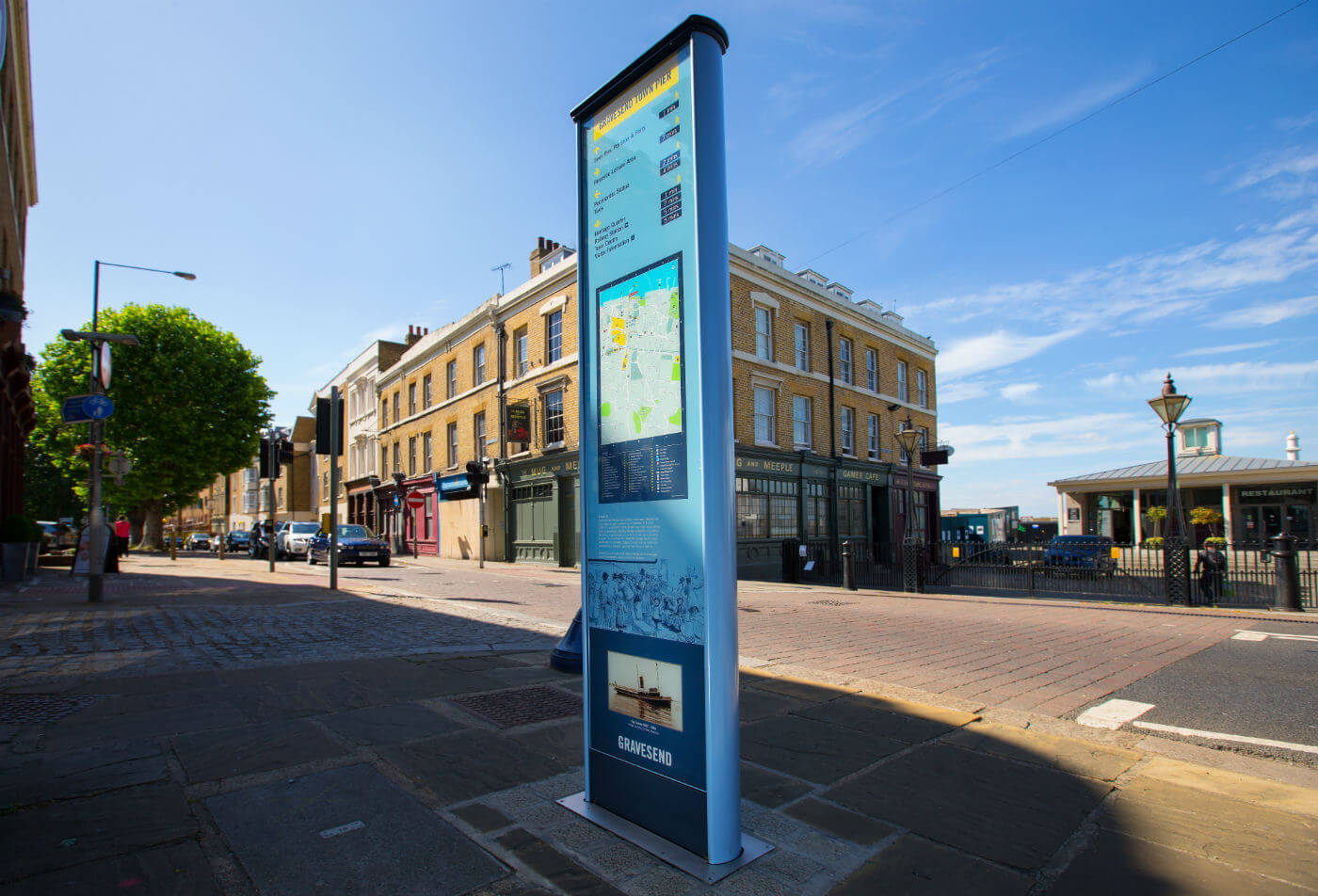
When the good people of Gravesend went about their business one morning they were met with a surprise – five way-finding monolith signs had sprung up across the town “overnight”. But who was responsible? A team of Reade Signs fitters, going the extra mile to give our clients exactly what they want. Municipal signs pointing to the post office or the park can just be functional or they can add something to the environment. At Reade Signs we always enjoy working with local authorities who want to make public spaces more attractive while providing a public wayfinding service. Gravesham Borough Council asked Reade Signs for a series of monolith signs, which feature historic images and inform the public about Gravesend’s rich historic connection with the Thames. The council wanted the monoliths to be put in place with as little fuss or disruption as possible in the run-up to last Christmas. So, rather than spend weeks fencing off pedestrian areas one at a time to install the concrete foundations and signage, we did all the groundwork first, setting a custom ground cage and frame into concrete foundations at the various locations around the town. We then fitted a temporary cover plate over each one so that pedestrians could safely walk over them. Our fitting team installed all the monoliths in one day, simply “plugging in” and bolting them down into the waiting sockets so they seemed to appear overnight to the public. Senior project manager Howard Beckman said: “The signs look really great and we’ve had some good feedback. They will last a long time as well as they’re powder coated and use stainless steel fittings.” Not only did the plan add to the wow factor but it cut down inconvenience to the public and saved the council money by avoiding the need for expensive route closure licences. We also refurbished the town’s existing 11 tourist finger-posts and added seven more with a modern sign system incorporating a beautiful finial on the top of each one in the shape of a Thames barge. The council commissioned the unique sculpture and we then developed several prototypes for a custom mounting point and corresponding base plate for all of the signs, coming up with a design that allowed the two parts to come together seamlessly. If you’d like more information or advice about how we can help enhance your local environment then please contact us, email enquiry@readesigns.com or ring 01252 336000.

Read More