Reade Blog

Vanarama HQ branding and signage
Branding

A winning team: Reade Signs helps promote football’s National League sponsor’s new HQ

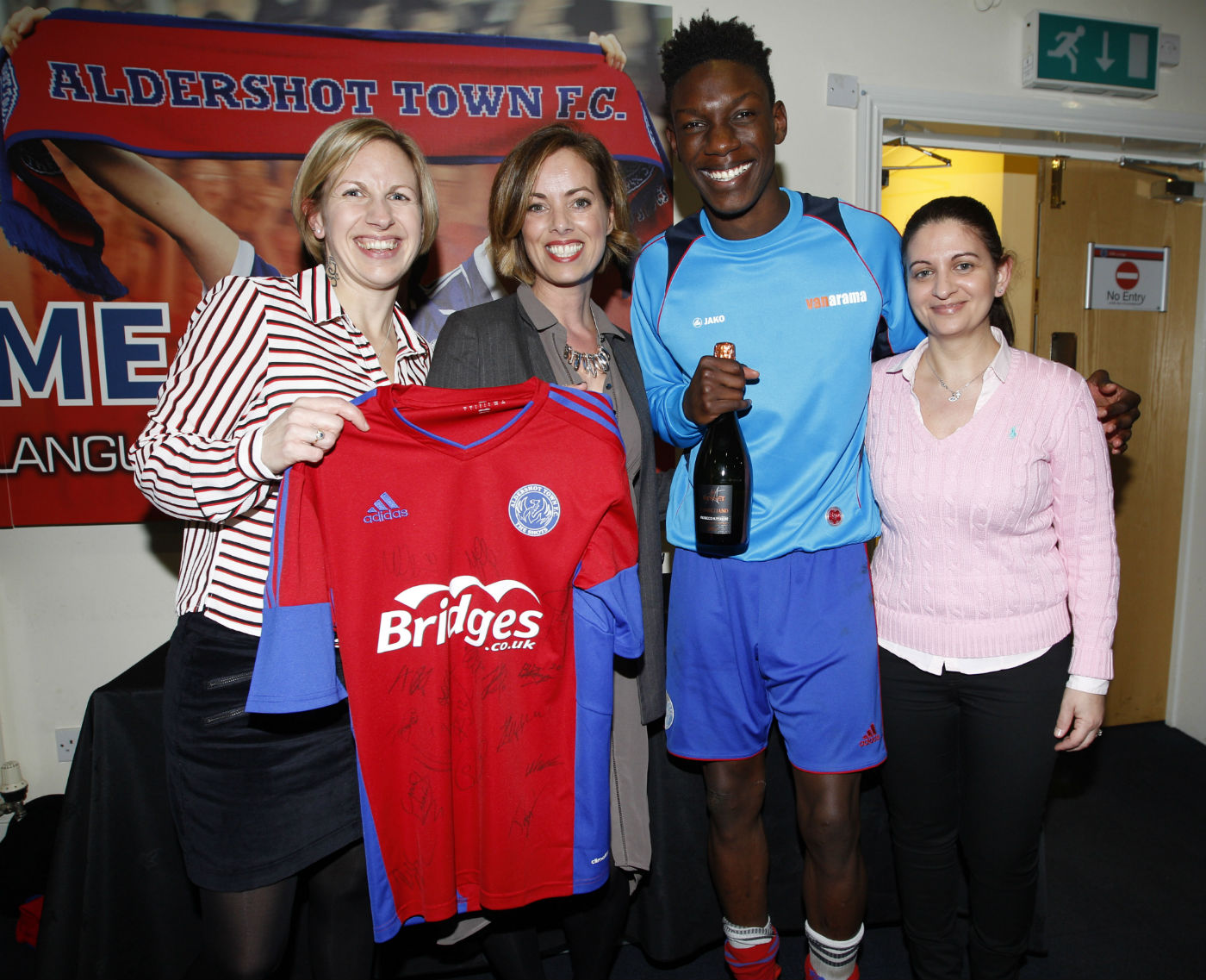
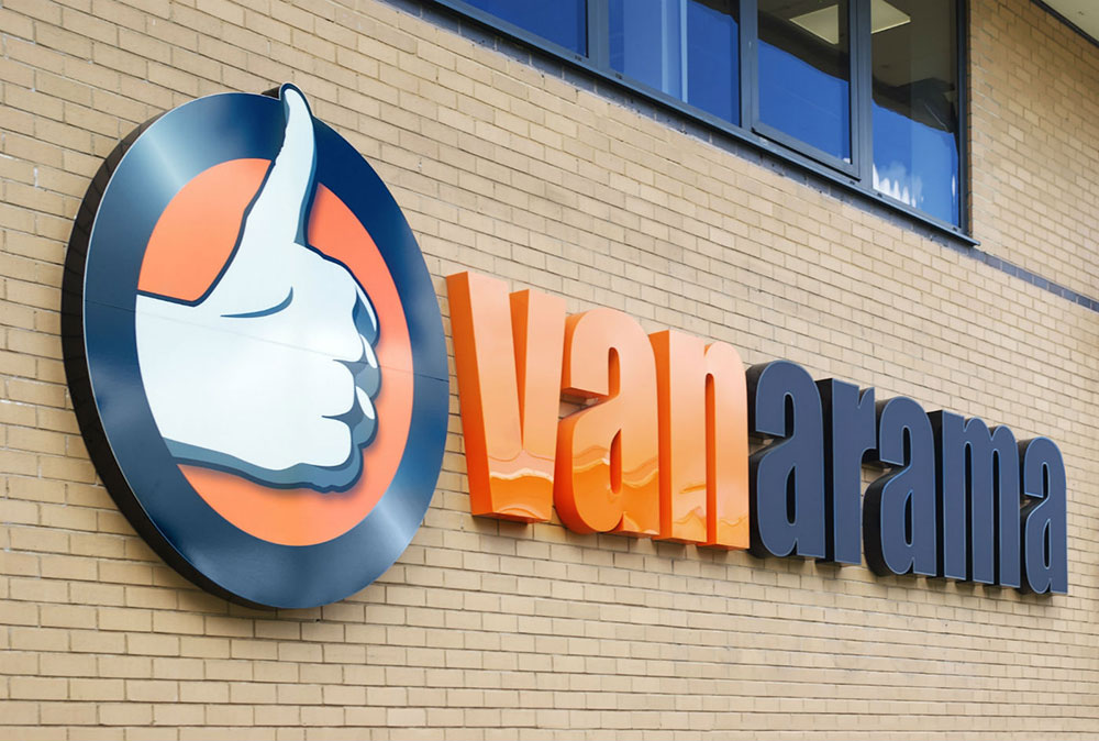
Reade Signs were recently signed up by the sponsor of the England National Football League to promote their new corporate headquarters. Established in 2008, commercial vehicle leasing company Vanarama outgrew their original premises and recently moved into larger headquarters in Hemel Hempstead. They wanted to make an impact with a big refurbishment programme to let everyone know they’d arrived, so they asked Reade Signs to create the signage for their new HQ. We recognised that the new signage had to express more than Vanarama’s branding, which they’d been successfully promoting through their sponsorship of the English National Football League. They wanted to publicise their new headquarters. Our brief was to turn a tired, unattractive and unwelcoming building into a bright new office headquarters that would feel welcoming not only to customers but to staff and suppliers too. We had an immediate rapport with our client because we shared a common passion in football. Aldershot FC plays in the National League and Reade Signs sponsors the South Stand at Aldershot’s Football Ground; we were also ball sponsors at an Aldershot home match in March. So we felt we were really able to deliver a creative solution to announce Vanarama’s arrival in their new home. That’s not to say, though, that we didn’t face a few challenges on the way. The challenge: backlit to black? Our clients operate long hours, seven days a week, so illuminated signage was a must. However black lettering features heavily within their logo and this is always difficult to light up. Our team has years of experience in sourcing the best materials and we found a specialist acrylic that appears black in daylight but changes colour, in this case to white, when illuminated. And we used rimless letters to ensure a crisp, clean look both by day and night, ensuring the whole face is illuminated. Making a monolithic impact Vanarama also wanted to make a big statement with a five metre high monolith. Such a large structure required planning permission and structural engineering drawings for the foundations, as well as a detailed electrical plan. Reade Signs has installed many monoliths in varying locations, from shopping centres and business parks to university campuses, and we are able to advise all of our customers how to use them to make the biggest impact for their brand. We’re also able to apply for all the necessary planning permissions as part of our project management service, taking care of all the details and difficulties so our customers don’t have to worry about any of it. In this instance, the monolith had to be built in several sections at our factory, but this lets our client update their messaging quickly and cheaply. We were even able to make a design feature of the jointing, lighting that up, too. In addition, Vanarama also has a back-illuminated bus shelter-sized poster case on both sides of the monolith allowing them to promote special offers, show when they are recruiting or even to congratulate the League winners at the end of the football season! Find out how Reade Signs can put you on the map If you want to put your new commercial premises on the map with some bold and welcoming branding for your customers and staff, then Reade Signs are the ideal signing for your team. If you’d like more information and advice about how you can best display your brand, then contact us, email enquiry@readesigns.com or ring 01252 336000.

Read More
Wayfinding vitreous enamel signs
Architectural

Growing old gracefully: the beauty of vitreous enamel signs

Reade Signs products can be found on display to the public all across the south east, but passers-by rarely admire them for the works of art that we think they are. However, that may change after we became involved in a public art project as part of a regeneration development in south London. We were asked to create lectern-style interpretation signs for two sculptures and a water fountain in public spaces. It’s great to be associated with art, but this project set us the challenge of coming up with signage that would look good, stand up to the elements and be appropriate next to some high profile pieces of artwork. We worked alongside the designers to create the wording and images to go with each piece of art in order to create an interpretation scheme for each of the installations. We also visited the sites, not only to look at the practicalities of installation and how best to relay the information required, which was obviously important, but to also get a feel for the place and for what would look right in these environments. As a result of our site visits, we decided to use a vitreous enamel finish to the signs because this time-honoured technique would give the signs a real heritage feel. Vitreous enamel (VE) has been around since the Victorian times and many of London’s most iconic street signs, including Downing Street, and London Underground’s station names are made from it, so there can be no question over its longevity. VE is made by fusing coloured glass powder to metal to give a tough glazed surface that will resist weathering for decades. The result is pleasing to the eye and very resistant to graffiti and impact damage. However, this is a complex, skilled and time-consuming process and we work with one of the few specialist factories in the country that still uses the traditional processes that allows us to deliver VE signage. During the process, the metal base is coated with layers of glass grit, with subsequent layers of colour added using silk screen printing methods. Each layer is then heat-treated at up to 800 degrees centigrade. Although vintage, it’s still a popular finish and we’ve used VE signs on a range of different, contemporary subjects, from town centre wayfinding to marketing suite signage, in locations from Manchester to Kent. It’s a very adaptable material. Why use Vitreous Enamel? Using VE enhances the look and feel of any sign. With its resistance to fading, longevity and the ease with which graffiti can be removed, it’s an ideal product for signage and interpretation in an urban environment. If you’d like more information and advice about creating vitreous enamel signage to your design, then please contact us – email enquiry@readesigns.com or call 01252 336000.

Read More
Sign installation at Royal Exchange, Kingston-Upon-Thames
Property

Where there’s a will, there’s a way

Sign installation is nothing if not varied. We had two major projects earlier this year which had similar issues – access – to overcome, but we had to do it in two very different ways. Royal Exchange, Kingston-Upon-Thames On the face of it, this looked like a straightforward job, erecting illuminated hoarding cladding to protect and promote a new housing development for one of our major clients. The brief called for a bright, illuminated design along a 200m perimeter around the Royal Exchange development in Kingston-upon-Thames. However, the main concern for us was the narrow pavement and busy road around the site, which was going to cause issues with how we could work safely. We had enough time before this project to plan properly and our client had given us a dedicated area for storing a limited amount of materials. However, it was halfway along the perimeter and we still had to get our equipment and hoarding cladding sheets to the specific work areas every day along the narrow pavement, with traffic rushing by. We came up with an innovative solution which we’ll be using on other jobs in the future. We designed a bespoke trolley that could be folded flat to fit into our vans but could be assembled and loaded with cladding sheets. It had “all terrain” wheels to cope with curbs and it worked a treat, mainly because the whole team, especially those who would have to use it, were involved in the design. Of course we had to run the design and construction past our client for health and safety reasons, but they were so delighted with our idea they promoted it within their organisation as an example of how sub-contractors can overcome problems with a bit of inventive thinking. We also instructed a traffic management company to cordon off areas of pavement every day, on a rolling basis, for us to work in. We had to be very safety conscious working by such a lot of traffic, particularly when members of the public insisted on getting around the barriers and walking along the busy road behind us. As for the design, we used built-up illuminated lettering and two recessed lightboxes so that it didn’t stick out over the pavement. The hoarding will be in place for a while, so the lightbox design allows us to update replaceable message panels easily and cost-effectively. Brunel Building, Paddington Our second project was for a hoarding around an office development at Brunel Building in London. The perimeter runs alongside the Paddington Canal. It was pretty obvious that erecting the hoarding alongside a busy waterway would be a challenge. Fortunately, we organised specialist contractors working on pontoons to put up our hoarding along 80 metres of canalside perimeter, so we didn’t have to put on the life jackets for that part. We simply manufactured the hoarding panels in our Aldershot factory. We used treated Sterling board for the client’s distinctively minimalist, unfinished plywood look. However, our challenge was to install a 64 metre section of hoarding spanning the canal on a footbridge. Cage fitters The canal is busy, so we couldn’t shut it to erect a platform to install the sheets; instead, our own hoarding fitters were suspended above the water in a cage from a crane. This needed a lot of careful health and safety planning and close coordination with the constructors because this part of the construction site was very cramped and busy. After several months, the job was completed. The self-adhesive letters and architectural drawing-inspired designs, picked out in white ultra-tack vinyl, look great and match our client’s corporate image guidelines. Access all areas? That just takes some time, planning and innovation Every job we do has its own challenges and sometimes they require a unique solution. But as far as Reade Signs are concerned, wherever there’s a hoarding to be put up, we will find a way to get a client’s message seen. If you’d like to know more about how Reade Signs can help your business get noticed, please contact us on enquiries@readesigns.com or call 01252 336000. Reade Signs – Applying Knowledge. Creating Visions. Delivering Value.

Read More
Merityre Tyre Specialist branding roll-out
Branding

Adaptability and flexibility: key considerations when rolling out a rebrand across multiple premises

Consistent brand is important for any business, especially when that business has premises spread over a wide geographical area. And it’s made more complicated if you want a modern, unifying look for a variety of different premises types and shopfronts. This was the challenge Reade Signs faced when car tyre specialists Merityre asked us to rebrand most of their 21 sites across southern England. We needed to take the newly adopted brand style that Merityre had implemented in 2012 and apply it as part of a rolling update plan for their designated branches, taking into account any local restrictions or conditions. Applying a rebrand, step by step Our first step was to survey every branch, to take measurements, photographs and to check any access issues. We then had to visualise the new brand, with its bright, yellow theme, into the survey pictures and make any necessary changes for the client to approve. Once we had approval, the next step was to get the designs through the planning permission process. This needed a lot of background work by us to make sure that both our clients and the local authorities were happy. Once everything was in place, we could move on to the next phase, the actual production and installation of all the signage. We had to source a single stock of self-coloured aluminium composite material (ACM) to guarantee consistency of the “Merityre yellow” branding across all locations. Once we produced and labelled the signage, we had to coordinate the installation of every sign with the individual branch managers to minimise any disruption to their daily operation. Finally, the products were despatched with installers on a pre-planned route to reduce travel time between sites. This helps keep costs down for us and our clients. Flexibility and an adaptable design concept are key to rebranding success This is an ongoing project and since the initial rebrand and installation there have been further challenges as the Merityre portfolio of sites expands; but it’s important that a concept is easily adapted to new uses. For example, we had to produce an update of the signage at Merityre’s Abingdon branch in a way that retained period features. And at Farnham we couldn’t sink supporting posts for a 3-metre high monolith because of underground services. So we came up with another solution. We improvised by using an existing concrete bollard with enough core strength for us to fix our timber onto it. Considerations for your rebranding There is a lot more to rebranding than choosing colours for your exciting new logo: Consistency: Will your branding stand out against a variety of backgrounds? Adaptability: Can the concept be adapted to different premises with different constraints? Planning considerations: Early engagement with planning authorities makes success more likely. Construction challenges: Do you have a Plan B? “Reade Signs proved instrumental in the seamless roll-out of our rebrand…their knowledge and attention to detail was second to none and we felt we were in expert hands from beginning to end. The signage across our branches stands as testament – it looks absolutely fantastic and we are so pleased with the finished result” – Dene Arnold, Merityre General Manager If you’d like more information and advice about how you can best display your brand, then please contact us, email enquiry@readesigns.com or ring 01252 336000. Reade Signs – Applying Knowledge. Creating Visions. Delivering Value.

Read More
Linden homes empire court hoarding & signage
Property

The first signs of spring

Is your site ready for the Spring crowd? With the busiest spell in the housing market fast approaching, now is an opportune time to review current site signage and hoarding. As experts in visual marketing, Reade Signs produce stunning, eye-catching signage that significantly increases the footfall, enquiries and visitors to our client’s sites. As industry leading experts in property signage, Reade Signs are the partner of choice for property developers. We have over 36 years of experience and currently work with the UK’s largest property developers amongst our impressive portfolio of clients. What do our clients love about working with Reade Signs? Well we are experts in our field and our clients know we will always deliver unbeatable service. As well as excellent communication throughout projects, Reade Signs completely manage and handle the entire build from start to finish, unburdening our clients. Key areas include: Communicating and working directly with sites, booking install slots that work best for them and avoiding clashes with other trades or site works wherever possible, causing minimal disruption. Reade Signs manages everything. This gives our clients peace of mind and allows them to focus on sales, knowing their site signage project is safe hands. Reade Signs only provides quality products that meet our stringent criteria. With our impressive in-house production facilities, we know all products are manufactured to our high standards, using approved materials. We also conduct rigorous checks so every product has been thoroughly inspected and approved before leaving the premises. This ensures Reade Signs products stand the test of time. Create and agree Risk and Method Statements (RAM’s) in advance. This organisation and process ensures safety compliance is always met before we start and whilst carrying out the install, benefiting both companies and employees as well as ensuring a smooth completion. All Reade Signs employees are fully trained and experienced, meaning they are versed in site protocol and procedures. “We invested a lot of time thinking about our next generation of marketing suites for Linden Homes, so finding the right delivery partner was a crucial step for us. Reade Signs’ experience not just in the property market, but in branding and retail knowledge made them our obvious choice. We liked many of the ideas they put forward during the tender process and incorporated these in our final specification. The short time between contract award to delivering the first installation demonstrated strong project management and flexibility on their part” – Vicky Cullen, Head of Marketing, Linden Homes Site Safety Site Health and Safety is of paramount importance to Reade Signs. We are fully accredited being Safecontractor and CQMS approved, as well as being members of the BSGA (British Sign and Graphics Association). We also have ISO 9001 and 14001 Quality and Environmental management accreditations. The importance of site signage Having worked with all of the country’s major housing developers over the past 36 years, we truly understand the importance of site presentation to potential buyers. Numerous surveys conducted independently and by housing developers conclude that the standard of signage is the top reason for improved footfall. Based on these findings, the better your signage, the better your footfall.

Read More
Reade Signs match sponsors for Aldershot v Lincoln game
Company News

Reade Signs match sponsors for Aldershot v Lincoln game

We had a great time at the EBB Stadium on Saturday 4th March where we were Match Sponsors for the Aldershot FC v Lincoln City game. It was a perfect opportunity for the Reade team to gather in support of our favourite team as they played top of the (National) league and F.A. Cup quarter finalist’s Lincoln City. It proved a lively and entertaining game with plenty of chances from both sides who were on form, and the 0 – 0 result means The Shots have been unbeaten in their last eleven matches. There was a strong emphasis on International Women’s Day running throughout the afternoon, and in the spirit of this the Reade ladies’ presented Man of the Match Bernard Mensah with his prize after the game. Reade Signs are in their 9th year of patronage at Aldershot FC and are proud sponsors of the South Stand at the EBB Stadium.

Read More
Great Malvern Route to the Hills
Architectural

Great Malvern’s route to the hills

Working alongside award winning experiential design company Outside Studios, Reade Signs were instructed to design and engineer a range of interpretive signs and structures throughout the historic spa town of Great Malvern in the West Midlands, famous for its 15km of ancient rocks and hills that surround the town and attract a wide range of visitors year round. Most commonly known as The Malvern Hills, the dramatic landscape offers walks and routes for both beginners and experienced walkers across its 160km of footpaths. The objective of the ‘Route to the Hills’ project was to create an interpretation trail between the Malvern Hills and the town itself, showcasing its heritage and migrating walkers from the hills and into the town through a series of bespoke plaques, artwork and signage. It was imperative that the series of signs complemented the Malvern Stone exposed throughout the town. The client’s original vision was to use bronze, but being notoriously expensive and prone to degrading and tarnishing, Reade Signs’ experienced team suggested a more economical and practical alternative – using aluminium panels coated with Verometal, a thin painted coating containing bronze – to achieve the desired effect at minimal cost with even greater usability. Committed to absolute customer satisfaction, the Reade team then conducted a thorough proto-typing process to ensure the perfect patina was found and agreed upon. We also advised that a suitable lacquer be applied so that all signage was weather resistant and graffiti-proof. As the signs and structures were to be installed partly on council grounds, a stipulation was that they needed the ability to be easily removed, leaving a finished and risk-free surface once extracted. The knowledgeable Reade team decided that Nal Retention Sockets would be the ideal solution, enabling the structures to be effortlessly installed – and removed – as opposed to using traditional foundations. A template the size of the actual signs was then manufactured and used to ensure the Reade installation team plotted and fixed the Nal Sockets with 100% accuracy and precision. By the time it came to fitting the actual signage, it was as simple as slotting the structures into place. With Safe-contractor and Quality and Environmental Management accreditations, our client was in the very best hands as our capable team worked closely with the Council’s Ground-worker and ensured a seamless installation. The result? A strong, clear and branded wayfinding scheme that reflects the town’s quirky personality and connects its rich history with its natural surrounds using inspiring, bespoke and quality signage. Reade Signs’ expert knowledge and experience enabled the customer’s visions to become a reality; saving money without compromise, using the best materials and providing the utmost attention and care throughout the entire process. Reade Signs – Applying Knowledge. Creating Visions. Delivering Value.

Read More
Linden homes sales marketing suite
Property

Reade Signs roll out next generation of marketing suites for renowned national housing developer

After a rigorous competitive tender exercise, Reade Signs were selected as the national partner for the roll out of Linden Homes’ next generation of marketing suites across the whole of England. Having vast experience in installing marketing suites for a number of prestigious housing developers meant we really understood the objectives for the new design and were able to offer many suggestions to achieve the desired results at optimal costs. And no mean feat to ensure all aspects of health and safety were considered without detriment to the sales environment. Our branding experience was also extremely useful in interpreting the clients’ brief for making the Linden Homes marque really stand out; an absolutely key consideration in today’s competitive marketplace. The client wanted the new format to be implemented as soon as possible and our challenge with this project was to get the first sites launched within 6 weeks of hearing we were the preferred supplier. The design scheme was still being finalised during this period as a result of some of the suggestions Reade Signs’ creative team made during the tender process. As well as selecting the best materials and finalising the design of bespoke furniture to both improve appearance and usability, and provide an inspiring environment for customers to select the finish of their new home. Bartons Rise, a development located in Havant, Hampshire, had an urgent need to start pre-sales from a temporary sales cabin to respond to local interest and generate further prospects before the site was ready for a full sales launch. So it was to be the first installation under the new contract but the floorplan did not fit with the newly developed brand guidelines and hence it was key that Reade Signs were able to interpret these and deliver an alternative configuration to create an inviting customer environment. Reade Signs put in place the operational plan for delivery alongside the finalisation of the design guidelines so the two elements were able to work in tandem, so not delaying the launch of any marketing suites, critical to the sales success of each Linden Homes development. Working closely with the Linden Homes’ Marketing Team, we were able to ensure the tight timescales to the first launch did not compromise their design vision in any way.Addressing the space restrictions was the first task and prioritising both the layout and the graphics that could be used. The team at Reade were able to quickly design a footprint that could be repeated in similar sized units providing the key areas for Sales Advisor working, customer greeting and a useful meeting area. The cleverly designed bespoke unit to house interior samples for customer selection was also able to be included meaning visitors could get excited about selecting their personal home interior from day one. Added to this, plenty of storage makes the interior both practical and stylish. Cabin walls present another challenge when installing graphics. To enable a big and bold approach, Reade Signs recommended an alternative material to the agreed specification for permanent installations. Clever interpretation of the guidelines meant all of the key messaging could be included despite very limited wall space. And to make life as easy as possible for the local marketing team, all aspects of Health and Safety were considered by Reade Signs meaning the layout, escape routes and all statutory signage were included as part of the package. And lastly, the co-ordination of fitting with both sales and site teams meant a smooth and easy installation with handover on time to enable a positive and well-received launch. Years of successfully working on site mean we understand the needs of Site Managers with an excellent compliance record, as well as the client needs for a successful project. The result? A fantastic example of how a development can be showcased at an early stage to the local community. The space issues do not compromise the Linden Homes brand and the overall scheme is both welcoming and professional. “We invested a lot of time thinking about our next generation of marketing suites for Linden Homes, so finding the right delivery partner was a crucial step for us. Reade Signs’ experience not just in the property developer market, but in branding and retail knowledge made them our obvious choice”. Vicky Cullen, Head of Marketing, Linden Homes Reade Signs – Applying Knowledge. Creating Visions. Delivering Value.

Read More
CYC:D Fitness Studio branding
Branding

Looking for inspiration to take more exercise? Easy… try signage!

CYC:D (Pronounced as psyched), is a new concept in fitness. A modern, stylish and inspiring boutique fitness studio with its first opening in Haslemere, Surrey, delivered by Reade Signs. The ethos behind CYC:D is simple yet very effective in today’s very crowded and competitive fitness market. The class schedule is designed to fit into a busy lifestyle, the booking process is super simple. No contracts, the best equipment, the best instructors and super cool music tracks. A unique combination of complementary group workouts providing a fitness experience which challenges the norms. So our brief? CYC:D asked us how do we communicate our individuality to our customers and make them want to keep coming back for more? Challenge one – CYC:D had put as much thought into the design of the studio as their offer. With very specific ideas, we were on hand to advise how those designs could be adapted for the public environment and adhere to health and safety legislation. A signage specialist like Reade Signs will be able to interpret such a brief and bring those concepts to life. This project included custom made neons behind acrylic panels for safety, stand-off lettering, and printed and cut vinyl to name but a few. Expensive bespoke illuminated light boxes were on the customer wish list and we designed and commissioned alternatives that created the same effect, at a fraction of the cost. Our team were also able to suggest further opportunities for branding in the shower and washrooms that hadn’t been considered and saved money over alternatives such as traditional tiling. Challenge two – Create a brick-effect wall finish in the main gym, but we want it 3D and you can’t fix into the already sound proofed walls. For all the specialist bespoke signage elements required, Reade Signs sourced all products using their extensive network of reliable connections developed over 35 years in business, providing a one-stop shop solution to the customer. The brick effect panels we recommended gave a fantastic finish to the studio and required minimal fixing to preserve the noise barrier. CYC:D were delighted with the result. Challenge three – Well to be fair it wasn’t really a challenge for us. CYC:D had a strict launch day and like all our customers, expect us to work with their timetable and around their other suppliers. In this particular case, the studio was already live and working whilst the interior and exterior signage was to be fitted. Reade Signs took charge of the project coordination, working closely with all parties involved to ensure each aspect of the project ran smoothly. The customer was fully informed of the process from start to finish and was delighted with the final product, which was installed and completed ahead of the launch day deadline. We provided full consultancy from the beginning with a designated Project Manager, tailoring the signage to the customer’s needs and visions with the best use of materials to achieve this. The most important bit? The excellent feedback and reviews CYC:D have received since opening. It’s truly an inspiring environment – so working out feels like fun. So we’ve delivered their mission – CYC:D is about more than just the workouts, it’s a lifestyle and a journey. We are delighted to have played our part. “[Reade Signs] ensured everything was ready to go for our opening and were mindful of working around our customers when we had opened. Installation was quick and expertly handled and we are extremely pleased with the quality of the signs. We would not hesitate to use them again“. Faye Walton, CYC:D Director. Reade Signs – Applying Knowledge. Creating Visions. Delivering Value.

Read More
Here East architectural wayfinding signage
Architectural

Here East – Innovative Thinking at Innovation City

Reade Signs recently undertook an exciting wayfinding project at the former press and broadcast centres of the Queen Elizabeth Olympic Park in Hackney Wick, home of the London 2012 Olympic and Paralympic Games. The Reade Signs Team were challenged to supply and install over 300 separate vinyl and painted wall graphics of varying sizes throughout the two huge buildings that were used as the Main Media Centre, International Broadcast Centre and Main Press Centre during the London 2012 Olympic and Paralympic Games. Now home to the likes of major telecommunications companies such as BT Sport and Infinity SDC, as well as Loughborough University and University College London campuses, it boasts a thriving space that offers state of the art facilities in an awe-inspiring environment. A comprehensive pre-installation site visit was carried out two days prior to installation commencing where each location was identified and temporarily marked on the wall with a unique sign code. Production and deliveries were divided by building, and then by floor, to avoid any mixing up of the numerous wayfinding items. The Production Team manufactured the items throughout the installation process and ensured Reade Signs’ on site teams were continually fed with work during the tight installation window. Jake Ellis, Assistant Property Manager, expressed his admiration of both the execution and look of the completed job, stating: “Reade Signs were great to work with from start to finish of this job. They were very thorough in undertaking such a large project and were flexible as the project changed and evolved. Feedback on the wayfinding has been excellent” The finished result is a vibrant wayfinding system that is clear and memorable. The project was also featured in renowned Architectural, Interiors and Design Magazine “DeZeen’ – Click here to read the full ‘DeZeen’ article

Read More