When Reade Signs underwent a rebrand, it was Reade HQ that was most in need of a make-over. It was essential for the building and surrounding areas to project the inspired, innovative and established feel behind the rebrand, and to reflect Reade Signs’ culture
The Brief
In the space of five years, our workforce had grown considerably, the car park was bursting at the seams, and the branding had started to date. The office space needed to be utilised in a more efficient and effective way, and both the building and branding were in need of reviving.
With Reade Signs approaching 36 years in the business, and undergoing a complete rebrand, a launch party had been arranged to celebrate this combined achievement. It was essential the new building reflected the quality and class of Reade Signs’ culture, evoked and inspired both visitors and staff alike, and was ready in time for the launch party.
The Solution
Time and effort was invested during the planning stage that involved in-depth evaluation and discussion regarding the customer and staff experience at Reade Signs, with comprehensive building and grounds assessments. With the help of www.crucialprojects.co.uk the Reade Signs building was transformed to a welcoming, vibrant and inspiring environment.
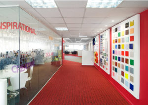
It is now an engaging, pleasurable and inspiring experience to visit Reade Signs. The car park has plenty of additional allocated space for visitor and staff parking, and the entrance is striking and bold. The welcoming reception incorporates a comfortable seating area with an interactive Smart TV, and a stairway featuring the striking Reade Signs wordwall leads into the stunning showroom. The gigantic sample boards are a real talking point, and the space is admired by all that visit.
Above all, Reade Signs’ new branding has a strong and prominent presence throughout.


