Reade Blog

Case Studies

Gravesend wayfinding signage

Municipal signs pointing to the post office or the park can just be functional or they can add something to the environment. At Reade Signs we always enjoy working with local authorities who want to make public spaces more attractive while providing a public service. Gravesham Borough Council asked Reade Signs for a series of monolith signs, which feature historic images and inform the public about Gravesend’s rich historic connection with the Thames. The council wanted the monoliths to be put in place with as little fuss or disruption as possible in the run-up to Christmas. So, rather than spend weeks fencing off pedestrian areas one at a time to install the concrete foundations and signage, we did all the groundwork first, setting a custom ground cage and frame into concrete foundations at the various locations around the town. We then fitted a temporary cover plate over each one so that pedestrians could safely walk over them. The SolutionOur fitting team installed all the monoliths in one day, simply ‘plugging in’ and bolting them down into the waiting sockets so they seemed to appear overnight to the public. Not only did the plan add to the ‘wow’ factor, it also cut down inconvenience to the public and saved the council money by avoiding the need for expensive route closure licences. We also refurbished the town’s existing 11 tourist wayfinding finger-posts and added seven more with a modern sign system incorporating a beautiful finial on the top of each one in the shape of a Thames barge. The council commissioned the unique sculpture and we then developed several prototypes for a custom mounting point and corresponding base plate for all of the signs, coming up with a design that allowed the two parts to come together seamlessly. Kent County Council

Read More
Dog House Creative Workspace
Case Studies

Dog House Creative

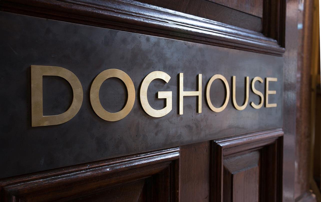
Dog House is a unique workspace for sole traders and business owners in Reading. It’s a refurbished, Grade II listed building designed to create a surprising and inspiring environment. The building is owned by TCN, which regenerates unloved buildings and creates surprising places for people to work. The design brief was to create signage with a playful twist to complement the exposed brick finishes, wooden floors and grand staircase. Reade Signs was selected to manufacture and install the signage. Our team worked closely with the design concepts to recreate them using the right materials for the desired effect. This project included fret-cut exterior logos, vinyl logos, tenant boards, lightboxes, toilet signage, meeting room signs, directional signage, gold floor numbers, funny quotes, 3D metal effect lettering, frosted glass graphics, wall vinyls and wayfinding. The final signage is stunning and quirky and is guaranteed to put a smile on visitors’ faces!

Read More
Case Studies

Gainsborough Children’s Centre

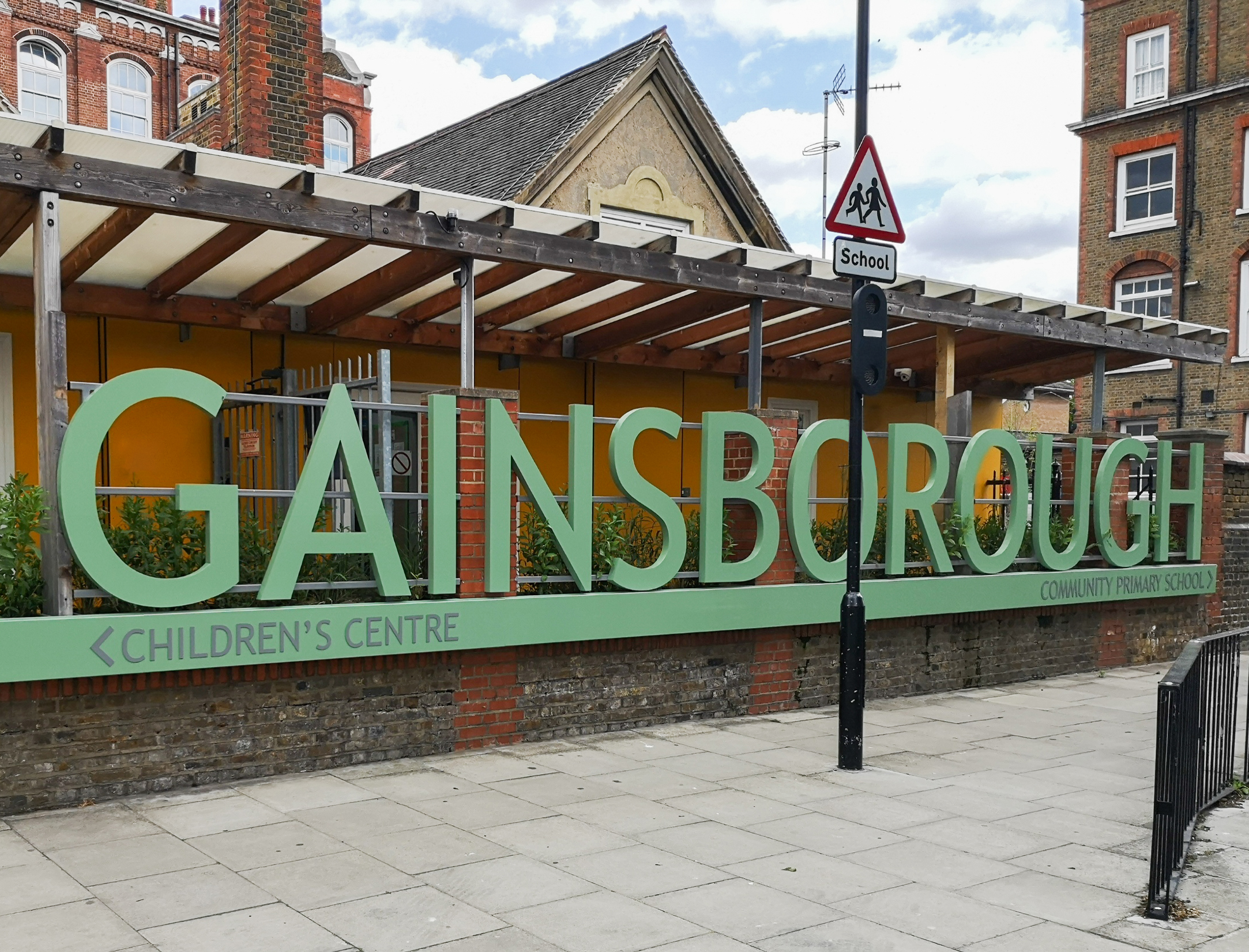
Working with main contractor to build and install these impressive 1300mm high letters to advertise the new Children’s Centre (which is attached to the Gainsborough Primary School in Hackney). The letters were manufactured in descaled stainless Steel and stove enamelled, creating an extremely durable finish. Led illumination was built into the trough at the base of the letters so that the light washes up the letters giving them a soft glow at night. Planters built in the same material as the sign were included as part of the scope The client was delighted with the finished sign.

Read More
Museum Wayfinding
Case Studies

Victoria & Albert Museum, London

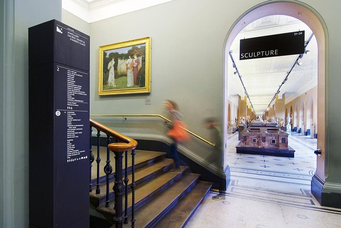
The award-winning V&A Wayfinding assignment was one of the most rewarding projects we have completed in recent years.  There were so many factors to be considered, not least the need to cause minimal disruption so that visitors and private events (which are the museums life blood) could continue. Most of the works were therefore carried out overnight and over several weeks. We worked closely with the museum’s estates team to ensure we could get the signs from one location to another and with limited storage space available on-site, staged deliveries were needed. Fixing into the walls and ceilings of one of London’s most iconic listed buildings is not for the faint hearted either, with extensive testing and sampling taking place before installation. There are over 400 signs in all, ranging from totem signs clad in black tulip wood, to projecting, wall mounted facilities signs, maps and hanging gallery signs. Each sign was fabricated by hand, with direct to media print being applied for the graphic elements, giving a durable, unbelievably sharp finish. The signage and wayfinding scheme won the coveted SEDG (Society for Experiential Graphic Design) ‘HONORS AWARD’ in 2020. Furthermore, the V&A undertakes continual visitor surveys and the results speak for themselves: 74 percent of visitors said that they found navigating easy or very easy, compared to 58 percent in the same period the prior year. The proportion of visitors answering “difficult” or “other” fell from 18 percent to just 3 percent.(Source V&A)

Read More
Case Studies

Sugar House Island

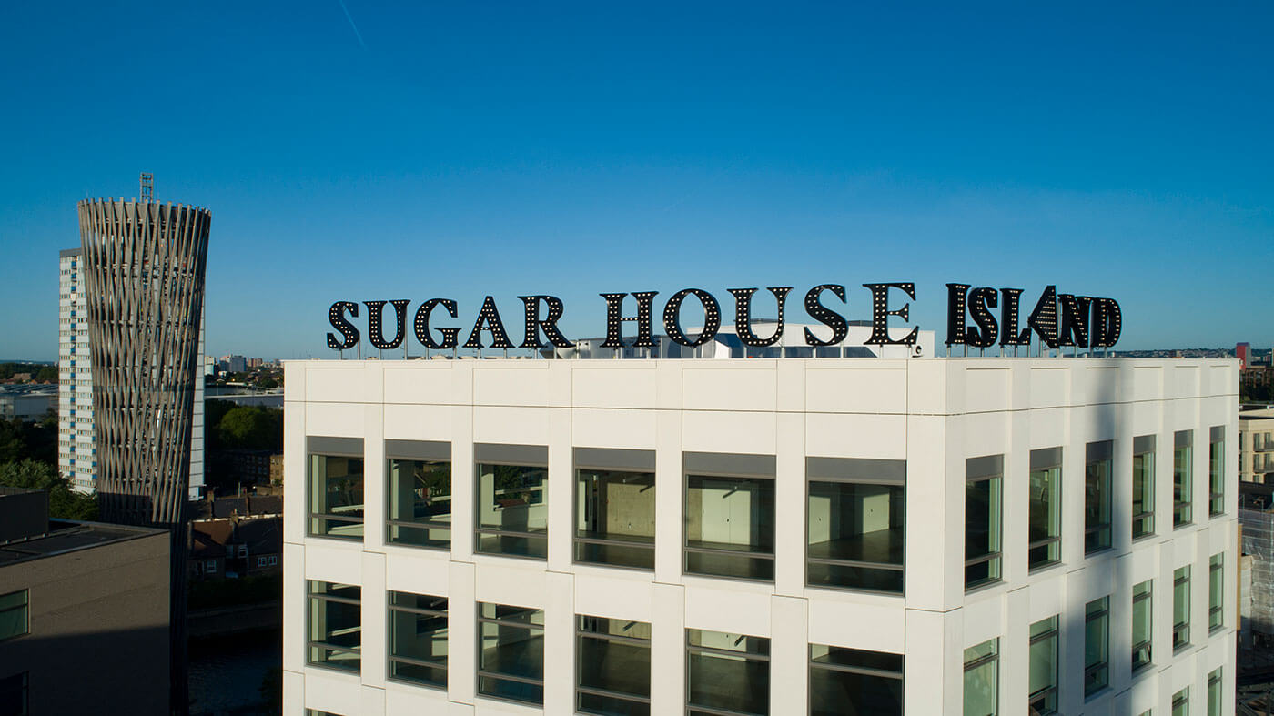
We were tasked with manufacturing and installing the 1.5 mtr high letters and logo on the top of No. 1 Sugar House Lane, the gateway to the new Sugar House Island development by international developer Vastint. Before the final letters could be manufactured we produced a full size sample and secured it in position on the roof so that the stake holders could view it from all angles and approve for production. Finally, the huge letters, with Cabochon lighting were fixed directly into the building’s steel work and cleverly designed by our team to hinge backwards to allow maintenance from the roof.  Dominating the skyline from the High Street, Stratford, they create a lasting landmark within the local area. The Logo and Visual Identity were designed by Kurz Gestaltung, Berlin.

Read More
Case Studies

London Estate Agents Office Renovation

The Reade Signs’ team enjoyed this exciting project of transforming an average looking office into a dazzling workspace that would excite and inspire staff and clients alike The Brief To produce stand-out graphics to dress the walls at the London Cityzen office not only to create that wow-factor, but to also disguise any structural defects and irregularities of the building, including undulating walls and boxed in areas prone to damp. The Solution Using images chosen by the client, and in line with their brand guidelines, Reade Signs designed a wall cladding on brushed stainless steel and ebony using full colour images. This required a lot of bespoke modelling of the clad to accommodate the unevenness of the walls, but the pictures speak for themselves! The results are outstanding. Reade Signs’ experienced and dedicated team created this modern, inspiring and exciting environment and enabled Cityzen’s vision to become a reality. “We employed Reade Signs to re-design our office. The end result was exactly what we were after and we often get compliments on our office from clients and passers-by. I wouldn’t hesitate in recommending Reade Signs to anyone and in fact we have used them again recently to create logos for our company cars.” Warren Black, Co-Founder, Cityzen

Read More
Case Studies

Merityre branding roll-out

Car tyre specialists Merityre have multiple branches across the south of England. Reade Signs proved instrumental in the seamless roll-out of Merityre’s new rebrand. Adaptability and Flexibility: Key considerations when rolling out a rebrand across multiple premises The Brief A consistent brand is important for any business, especially when that business has premises spread over a wide geographical area. And it’s made more complicated if you want a modern, unifying look for a variety of different premises types and shopfronts. This was the challenge Reade Signs faced when car tyre specialists Merityre asked us to rebrand most of their 21 sites across southern England. We needed to take the newly adopted brand style that Merityre had implemented and apply it as part of a rolling update plan for their designated branches, taking into account any local restrictions or conditions. The Solution Our first step was to survey every branch, to take measurements, photographs and to check any access issues. We then had to visualise the new brand, with its bright, yellow theme, into the survey pictures and make any necessary changes for the client to approve. Once we had approval, the next step was to get the designs through the planning permission process. This needed a lot of background work by us to make sure that both our clients and the local authorities were happy. Once everything was in place, we could move on to the next phase, the actual production and installation of all the signage. We had to source a single stock of self-coloured aluminium composite material (ACM) to guarantee consistency of the “Merityre yellow” branding across all locations. Once we produced and labelled the signage, we had to coordinate the installation of every sign with the individual branch managers to minimise any disruption to their daily operation. Finally, the products were dispatched with installers on a pre-planned route to reduce travel time between sites and keep costs down. “Reade Signs proved instrumental in the seamless roll-out of our rebrand…their knowledge and attention to detail was second to none and we felt we were in expert hands from beginning to end. The signage across our branches stands as testament – it looks absolutely fantastic and we are so pleased with the finished result” Dene Arnold, Merityre General Manager

Read More
Case Studies

Reaching for the Sky

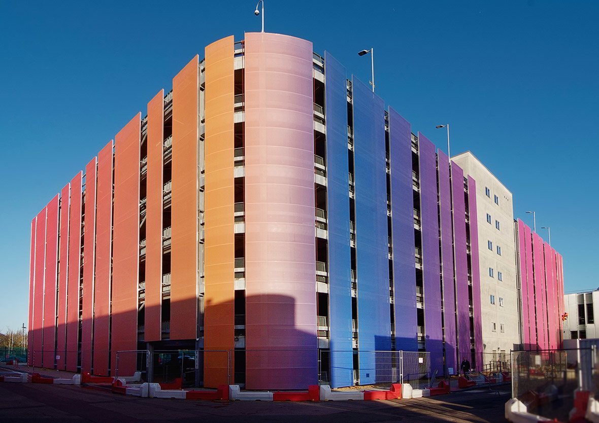
A bespoke project recently completed in West London proved no job is too big or too high for the Reade Signs team The Brief We were asked if we were able to fabricate and install 56 coloured PVC mesh banners around a brand new multi-storey car park in West London. Oh and by the way, the banners are almost 20 metres in height and up to 7 metres wide and there are just 6 weeks to complete the works. This was a truly mammoth undertaking. We had to build the aluminium frames on site in the middle of winter – no two banner frames were the same size or colour. The frames and banners were fitted using teams of abseilers, and to top it all – the car park was in use 24 hours a day throughout the project. The Solution A detailed project plan was key here as there were so many elements to bring together. The structural calculations, drilling templates and fabrication drawings had to be signed off prior to site works beginning and working areas had to be cordoned off and agreed to ensure the safety of our work force, the general public and the car parks users. Happily we achieved all our objectives, the only hold ups were a few days of high winds where the abseil teams couldn’t work safely. The end product is simply stunning and a testament to what can be achieved with the right team, meticulous planning and an unswerving belief that we could get the job done. The end result is stunning turning a car park into a major talking point from all vantage points. The client is delighted with the end results and complimented the team on their tenacity and dedication to execute the project in such a professional and smooth manner. “We’re very pleased with how the car park is looking. Great job. Thanks!” Nick Green, Property Manager

Read More
Case Studies

Reade Signs HQ Makeover

When Reade Signs underwent a rebrand, it was Reade HQ that was most in need of a make-over. It was essential for the building and surrounding areas to project the inspired, innovative and established feel behind the rebrand, and to reflect Reade Signs’ culture The Brief In the space of five years, our workforce had grown considerably, the car park was bursting at the seams, and the branding had started to date. The office space needed to be utilised in a more efficient and effective way, and both the building and branding were in need of reviving. With Reade Signs approaching 36 years in the business, and undergoing a complete rebrand, a launch party had been arranged to celebrate this combined achievement. It was essential the new building reflected the quality and class of Reade Signs’ culture, evoked and inspired both visitors and staff alike, and was ready in time for the launch party. The Solution Time and effort was invested during the planning stage that involved in-depth evaluation and discussion regarding the customer and staff experience at Reade Signs, with comprehensive building and grounds assessments. With the help of www.crucialprojects.co.uk the Reade Signs building was transformed to a welcoming, vibrant and inspiring environment. It is now an engaging, pleasurable and inspiring experience to visit Reade Signs. The car park has plenty of additional allocated space for visitor and staff parking, and the entrance is striking and bold. The welcoming reception incorporates a comfortable seating area with an interactive Smart TV, and a stairway featuring the striking Reade Signs wordwall leads into the stunning showroom. The gigantic sample boards are a real talking point, and the space is admired by all that visit. Above all, Reade Signs’ new branding has a strong and prominent presence throughout.

Read More
Case Studies

CYC:D Fitness Studio

CYC:D (pronounced psyched), is a new concept in fitness. A modern, stylish and inspiring boutique fitness studio with its first opening in Haslemere, Surrey The Brief CYC:D asked us how they communicate their individuality to customers and make them want to keep coming back for more. With very specific ideas about the design and feel of their studio, their wish-list included expensive bespoke illuminated light boxes, traditional tiling in the shower and washrooms, and a 3D brick-effect wall finish in the main gym, which wouldn’t be able to be fixed to the already sound-proofed walls. There was also a strict launch day, and like all our customers, they required us to work harmoniously with their timetable and around other suppliers. The studio was already live and working whilst the interior and exterior signage was to be fitted. The Solution Reade Signs provided full consultancy from the beginning with a designated Project Manager, taking charge of the project coordination and tailoring the signage to the customer’s needs and visions with the best use of materials. We were able to advise how the customer’s ideas and designs could be adopted for the public environment and adhere to health and safety legislation. We designed and commissioned alternative solutions to the desired expensive light boxes that created the same effect – at a fraction of the cost – using our extensive network of reliable connections developed over 35 years in the business. Our team were also able to suggest further opportunities for branding in the shower and washrooms that hadn’t been considered and saved money over traditional tiling. The brick effect panels we recommended gave a fantastic finish to the studio and required minimal fixing to preserve the noise barrier. The customer was fully informed of the process from start to finish and was delighted with the finished product, which was installed and completed ahead of the launch day deadline. We appointed Reade Signs to produce and install all of our internal and external signage at our new boutique fitness studio, CYC:D, in Haslemere, Surrey. We had really specific ideas for some of the signage and we worked closely with Pete Merrifield who provided expert advice on the most appropriate materials and finishes to ensure we got the exact finished product we were looking for. Nothing was too much trouble and we are extremely happy with the resulting work. Reade were also able to assist with the required artwork and provide great advice on what could and couldn’t be achieved. They ensured everything was ready to go for our opening and were mindful of working around our customers when we had opened. Installation was quick and expertly handled and we are extremely pleased with the quality of the signs. We would not hesitate to use them again. Faye Walton – Director CYC:D

Read More