Reade Blog

Building Signage
Case Studies

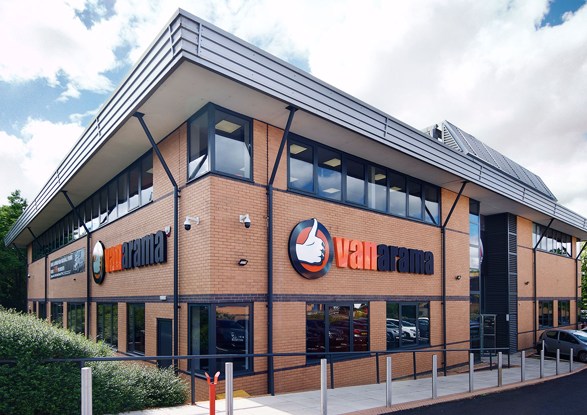
Vanarama new corporate HQ signage

Reade Signs were recently signed up by the sponsor of the England National Football League to promote their new corporate headquarters The Brief A winning team: Reade Signs helps promote football’s National League sponsor’s new HQEstablished in 2008, commercial vehicle leasing company Vanarama outgrew their original premises and recently moved into larger headquarters in Hemel Hempstead. They wanted to make an impact with a big refurbishment programme to let everyone know they’d arrived, so they asked Reade Signs to create the signage for their new HQ. We recognised that the new signage had to express more than Vanarama’s branding, which they’d been successfully promoting through their sponsorship of the English National Football League. They wanted to publicise their new headquarters. Our brief was to turn a tired, unattractive and unwelcoming building into a bright new office headquarters that would feel welcoming not only to customers but to staff and suppliers too. The Solution Vanarama operates long hours, seven days a week, so illuminated signage was a must. However black lettering features heavily within their logo and this is always difficult to light up. Our team has years of experience in sourcing the best materials and we found a specialist acrylic that appears black in daylight but changes colour, in this case to white, when illuminated. And we used rimless letters to ensure a crisp, clean look both by day and night, ensuring the whole face is illuminated. Vanarama also wanted to make a big statement with a five metre high monolith. Such a large structure required planning permission and structural engineering drawings for the foundations, as well as a detailed electrical plan. We applied for all the necessary planning permissions as part of our project management service, taking care of all the details and difficulties so our customers don’t have to worry about any of it. In this instance, the monolith had to be built in several sections at our factory and this lets our client update their messaging quickly and cheaply. We were even able to make a design feature of the jointing, lighting that up, too. In addition, Vanarama also has a back-illuminated bus shelter-sized poster case on both sides of the monolith allowing them to promote special offers, show when they are recruiting or even to congratulate the League winners at the end of the football season!

Read More
Office rebranding at Broadgate Quarter
Case Studies

Office rebranding at Broadgate Quarter

Reade Signs were asked by London-based branding firm Socrates Communications to work with them on the rebranding of Broadgate Quarter – a landmark building in the heart of London’s newly fashionable East End The Brief Broadgate Quarter: Refurbishing in the heart of LondonThe 10-storey office block was undergoing a major refurbishment so we were expecting some artistic, innovative and technical challenges within a tight timeframe – and that’s exactly what we got. We were given a comprehensive brief: Remove the original stainless steel letters from a marble wall and clean it up Fit a large (2.9m x 1.9m) glass directory back onto the marble Apply floor graphics and stunning digital wall murals Apply a striking, toughened 2.9m x 1.9m painted back glass and vinyl directory. The Solution Removing the old letters from the marble was difficult and left some visible holes across an area around three metres across. These all had to be filled to match the contours of the original marble. On top of that, due to the weight of the glass, we weren’t happy just relying on the fixings to hold all of the weight in place. After a bit of careful consideration, Reade’s installation manager and his team used their technical background and experience to excellent effect with a bit of on-the-spot problem solving. Their solution was to design steel bars across the fixing holes to counterbalance the weight of the glass. The artwork was approved by the client on the Wednesday evening of the job, leaving us just two working days to upload and prepare the artwork ready for printing. We supplied the digital mural artwork on the Thursday morning, and the first installation was done on the Monday evening. More than 230 metres of digital wall vinyl was printed, turned around and fitted within two working days! But it was worth it – the walls have a striking appearance with a radical graffiti design across the building’s 8th and 9th floors – not only serving the purpose of standing out from the crowd but ultimately, selling the space. Reade Signs were tasked with providing exterior signage and window manifestations at 9 Appold Street as well as printing and installing wall and complex floor graphics over two floors for the building launch.The exterior signage installation was challenging and required a fair amount of planning plus the deadline for completion of the project was extremely tight which necessitated working after hours. Reade Signs completed the work on time, as per quote which they have done for all the projects they have undertaken for us and we would happily recommend them for similar projects. Bambi Montgomery – Head of Special Project, Design & Production, Socrates Communications

Read More
Case Studies

Game, Signs and Match

The Reade Signs team revelled in the opportunity to manufacture and install a vast array of signage for this prestigious pre-Wimbledon tennis event The Brief Game, Signs and Match – Aegon Classic Tennis Tournament, BirminghamThe Reade Team were tasked to prepare the tournament’s advertising, hospitality and event signage including directional signage, banners, score-boards, ticket office signage, umpire chairs and court advertising, and efficiently install it whilst the club was still in use by members and VIP players. It was paramount all artwork was compatible for television, and with major sponsors being secured up until the very last minute, this was a task in itself! The Solution The Reade Team worked openly with event organisers The Lawn Tennis Association and all sponsors to ensure a seamless and prompt installation, and met each deadline in a timely manner. Meticulous attention to artwork design and colour detail was essential, as were thorough site surveys, and a complete understanding of the tennis courts’ perimeter advertising system.

Read More
Case Studies

‘Flash Sale’ Marketing Suite Up as Quick as a Flash

Reade Signs had four and a half days to manufacture and install a temporary marketing suite on the third floor of the old ‘Comet’ Head Office building in Hertfordshire The Brief The property developer was holding a ‘flash sale’ on a suite of apartments imminently and as such required temporary marketing suite signage that included printed wallpaper, freestanding units (all made from scratch), wall-mounted imagery and cladding of old, poorly ventilated elevators…all within the space of four and a half days! The Solution The Reade Sign’s project team immediately got to work researching, designing and manufacturing the products and materials, and worked closely alongside the installation team to ensure the project was executed smoothly and efficiently in the limited time frame. The client was delighted with the look of the marketing suite and impressed with the extremely quick turnaround.

Read More
Case Studies

Axis: Urban Styling

Reade Signs was tasked with creating a modern, ambient and chic marketing suite to drive immediate sales following a major launch event. The Brief A major regeneration project, ultra-modern apartments, and the marketing suite needed to reflect this and drive immediate conversions from their launch event. The Solution The Reade Signs team designed a centrepiece neon sign for the AXIS logo and hung it directly behind the main sales desk. Overall we created many pieces to compliment the chic environment, including a slick iPad driven interactive plot finder system.

Read More
Howarth Homes Uxbridge
Case Studies

Marketing New Homes in Uxbridge

This was an exciting challenge to produce and install a striking hoarding clad with large sections of illuminated text and logos The Brief To maximise the potential of site marketing, the client wanted an eye-catching site hoarding design that had large sections of illumination. A key requirement was the ability to update the signage as the development progressed. But a prominent street location meant we should take into account reducing the potential for malicious damage. The original timber hoarding had significant variances in height, had not been designed to accommodate any form of illumination and had no provision for the supply of power. The Solution A design was developed following a detailed survey of the hoarding to make sure that the rises and falls were taken into consideration. We than manufactured printed panels which were routed out to accept opal acrylic inlays for the logos and text. The acrylic was back-lit using super-bright LEDs, which provide great reliability, are low maintenance, and are far more economical to run than fluorescent tubes. Falling prices have made these more cost-effective and they are now our recommended option for most applications of this type.

Read More
Case Studies

Lights, Camera, Action

This was a challenge with a difference … providing illuminated hoarding based on a client’s site on Studio Way, featuring an action movie theme to coincide with the launch of the latest Bond film. The Brief Working to a very tight time frame, the client brief included the need to enhance the visibility of the marketing suite, make full use of the limited space and the site hoarding as well as keeping their customers safe and segregated from the construction traffic. The Solution Halo-illuminated letters fitted at high level drew instant attention to the marketing suite. We adapted large sign panels to be visible above the hoarding. We then clad the hoarding with printed panels adding clear directional information to help their customers navigate safely around the development. Our on-site team established a strong relationship with the site manager and lead electrician to develop a staged installation plan. The hoarding was surveyed by our team as it was built, and our studio team worked their usual magic to ensure the design fitted and followed the incline of the hoarding seamlessly.

Read More
architectural signage
Case Studies

Ordinary Hoarding Transformed into a Chic and Elegant Marketing Resource

Standing at 560ft, and rising 50 storeys on the Southern side of Blackfriars Bridge, Berkeley Group’s One Blackfriars development dominates the Thames skyline and offers some of the highest-class apartments in London. When the site underwent a rebrand across the exclusive multi-year development, they approached Reade Signs’ expert team. The Brief Our client’s instruction was to use reflective vinyl laminated on 250m of hoarding panels. Our experienced signage consultants advised against this, having assessed potential hazards from the reflection of passing vehicles on the busy surrounding roads. The Reade Sign’s team were given a period of just three weeks to deliver the project. The Solution Reade Signs offered the solution of using pearlescent vinyl with printed visuals laminated to ACM panels, along with self-adhesive gold text and logos, fulfilling the brief of a reflective finish with stunning impact, but without dazzling drivers. Safe in the hands of a business with decades of experience, knowledge and expertise, the project was completed on time, on budget and with a happy client with a quality hoarding that reflects the prestigious development it surrounds.

Read More
Case Studies

Sign installation at Royal Exchange, Kingston-Upon-Thames

Sign installation is nothing if not varied and sometimes there are access issues to overcome to ensure health and safety compliance. This installation for a new property development required some innovative thinking The Brief On the face of it, this looked like a straightforward job, erecting illuminated hoarding cladding to protect and promote a new housing development for one of our major clients. The brief called for a bright, illuminated design along a 200m perimeter around the Royal Exchange development in Kingston-upon-Thames. However, the main concern for us was the narrow pavement and busy road around the site, which was going to cause issues with how we could work safely. We had enough time before this project to plan properly and our client had given us a dedicated area for storing a limited amount of materials. However, it was halfway along the perimeter and we still had to get our equipment and hoarding cladding sheets to the specific work areas every day along the narrow pavement, with traffic rushing by. The Solution We came up with an innovative solution which we’ll be using on other jobs in the future. We designed a bespoke trolley that could be folded flat to fit into our vans but could be assembled and loaded with cladding sheets. It had ‘all terrain’ wheels to cope with curbs and it worked a treat, mainly because the whole team, especially those who would have to use it, were involved in the design. Of course we had to run the design and construction past our client for health and safety reasons, but they were so delighted with our idea they promoted it within their organisation as an example of how sub-contractors can overcome problems with a bit of inventive thinking. We also instructed a traffic management company to cordon off areas of pavement every day, on a rolling basis, for us to work in. We had to be very safety conscious working by such a lot of traffic, particularly when members of the public kept getting around the barriers and walking along the busy road behind us. As for the design, we used built-up illuminated lettering and two recessed light boxes so that it didn’t stick out over the pavement. The hoarding will be in place for a while, so the lightbox design allows us to update replaceable message panels easily and cost-effectively.

Read More
Case Studies

Linden Homes Marketing Suites National Roll Out: Bartons Rise

After a rigorous competitive tender exercise, Reade Signs were selected as the national partner for the roll out of Linden Homes’ next generation of marketing suites across the whole of England The Brief Bartons Rise, a Linden Homes development located in Havant, Hampshire, had an urgent need to start pre-sales from a temporary marketing suite to respond to local interest and generate further prospects before the site was ready for a full sales launch. It was to be the first installation under the new contract but the floorplans did not fit with the newly developed brand guidelines and therefore it was key that we were able to interpret these and deliver an alternative configuration to create an inviting and inspiring customer environment. The Solution Addressing the space restrictions was the first task, while prioritising both the layout and the graphics that could be used. The team at Reade Signs was able to quickly design a footprint that could be repeated in similar sized units providing the key areas for sales advisors, welcoming customers and a useful meeting area. The cleverly designed bespoke unit to house interior samples for customer selection was also included meaning visitors could get excited about selecting their home interior from day one. Added to this, plenty of storage made the interior both practical and stylish. All aspects of health and safety were considered, when designing the layout, so escape routes and all statutory signage were included as part of the package. The co-ordination of fitting with both sales and site teams meant a smooth and easy installation with handover on time to enable a positive and well received launch. Years of successfully working on site mean we understand the needs of site managers with an excellent compliance record, as well as the client needs for a successful project. This was a fantastic example of how a development can be showcased at an early stage to the local community. The space issues don’t compromise the Linden Homes brand and the overall scheme is both welcoming and professional.

Read More