Reade Blog

bespoke signage
Case Studies

L&Q development: ‘The Rushgroves’

Full marketing signage, sales and marketing suite and two-bedroom show apartment for a stylish new North London development The Brief Leading UK housing association and developer, L&Q, commissioned Reade Signs to create a combined marketing suite for three sales people, a two-bedroom show apartment and full external marketing signage within their new development in London NW9. We would be limited for space, time and resources and working on a busy building site with a 25-strong team of plumbers, carpenters, plasterers, decorators, furniture movers and window fitters, so health and safety would be critical. The Solution We created a two-storey, semi-permanent structure that conveys the experience of living in The Rushgroves, while delivering its sales function. On the ground level is a welcoming area with private sales meeting room, staff kitchen and facilities. Upstairs there is a boardroom and a chic show apartment, designed with the target market in mind. We built the space and installed carpets and floor coverings. The L&Q interior designers then placed furniture, window dressings and dressed the space using modern furniture to create an edgy up-to-the-minute space, with an art deco vibe. The brand is prominent throughout with attention-grabbing marketing features, including: hoarding, illuminated logos, graphics, landscaping and a water feature. The marketing suite and show apartment was designed to help customers visualise their new home and provide a supportive and comfortable environment for staff and visitors. The sales team is now enjoying working in the beautifully designed space.

Read More
Case Studies

Beaufort Park – hoarding, lightboxes and signage with an eye-catching twist

A major development with hoarding, lightboxes, built-up illuminated lettering, wayfinding signage, totems and marketing suite signage The Brief Our initial brief from St George was to replace site hoarding at Beaufort Park in Hendon due to a revamp of all marketing signage, which had to be achieved prior to marketing launch. Beaufort Park is a mixed-use development providing a Mediterranean-style boulevard of shops, bars and restaurants as well as 2,800 homes. We were tasked with revamping the whole hoarding along Aerodrome Road and the perimeter of the new phase; a total of 240 linear meters. To showcase the development’s spa, gym and interiors, we needed to include lightboxes, with interchangeable faces and built-up illuminated lettering to a high-level corner section. A second phase signage project has also now been completed. The Solution The brief was to incorporate five large (over 3.3 x 2.5 m and 5.5 x 3 m), rhombus shaped light boxes into the hoarding. This was a bit of a challenge in itself because of the weight of the lightboxes. However, we also had the added complication of the proximity of the hoarding to the public footpath, meaning we couldn’t fit traditional lightboxes to the face of the hoarding. To address this, our team liaised with the site team and contractors to recess the lightboxes into the hoarding. We also ensured the hoarding would take the extra weight, without compromising its structure. This really made the development images pop-out for passers-by. The hoarding was also matt sealed, as opposed to gloss, which gives it a much more upmarket look and feel.  As the development has progressed, we have also installed a second phase of signage around the site. This was designed to showcase the heritage of the Hendon Aerodrome, which is located next to the development and is now a Museum to the army air corp. This included large illuminated lettering, wayfinding signage, totems and other building and marketing suite signage. We have since installed new branded ACM cladding and refaced the existing lightboxes. Using the initial designs from the St George technical department and after several brainstorming sessions, we agreed and created the final signage. Our challenge was to source the correct materials and work within a tight time frame. The weather was also against us, particularly as large concrete bases had to be cast in heavy downpours. At the same time, we removed old signs and installed the new ones in minimal time, working around the public and busy roads. Our team worked closely with the development management to ensure minimal disruption and collaborated well with other tradespeople.  We had to coordinate several install teams working on the hoarding at the same time to achieve the required finish date, which also meant our production team created three teams worth of work at the same time. This was achieved with a high level of planning and coordination between our production and install teams. Roy Cheesman, Senior Account Manager

Read More
Case Studies

Walton Court Gardens – bespoke sales suite and full signage package

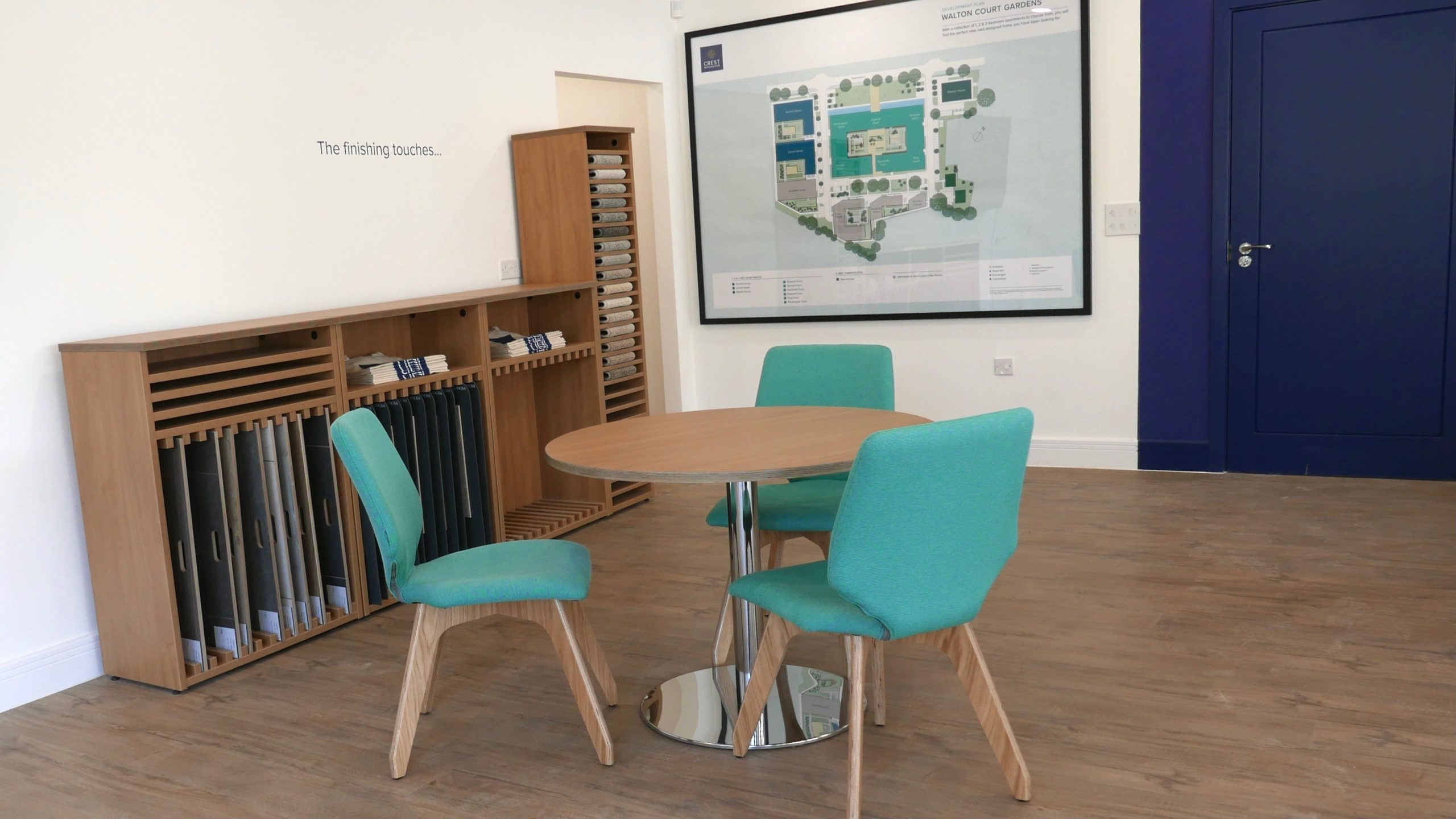
A large Crest Nicholson development with a mix of one, two- and three-bedroom apartments and three-bedroom townhouses in Walton-on-Thames The Brief Regent’s Crescent in Marylebone was originally built in 1820 for the Prince Regent, later George IV. Designed by architect John Nash, it boasts grand proportions and a sweeping façade and is one of London’s great historical landmarks. The Grade I listed development consists of 67 apartment residences and nine garden villas, with interior design by Millier. Reade Signs won a competitive tender to manufacturer and install the internal and external wayfinding signs at Park Crescent, part of this high-end luxury development. The Solution The process began six months prior to installation, following acceptance of The Velvet Principle’s designs and our production costs. We worked in collaboration with the client team, which included a wayfinding consultant, architect, developer and designer. We start every large architectural project by producing a detailed schedule. This is used as a working document to reflect the changes to specification that occur during site surveys, meetings or in email dialogue. In our schedule, every sign is assigned a unique code, which can be cross-referenced with sign location plans. The document gives our clients piece of mind that we fully understand the design intent and we communicate this detail to all members of our design, manufacturing and installation teams. Alongside scheduling, we manufactured samples of each different sign type to provide a benchmark for agreed quality standards. Once samples and schedules were approved, we could commence manufacture and installation planning. The specification was for high-end materials to match those used throughout the fit-out. Each laser cut letter needed an antique brass finish to give the right patination and some of the signs were powder coated in a dark bronze. A jewellery-like quality was specified, so we hand-finished and polished each letter and number to achieve a burnished effect. During the installation process, we agreed the exact location for each sign with the architect. Some of these needed to be changed and fixings adapted due to textured wall finishing. We also sourced specialist tapes, which is an essential part of working in a listed building, since you can’t drill into the walls. We completed the installation of this permanent signage in phases to coordinate with the construction milestones. Although this was a complex project, it went very smoothly from start to finish. I found the Reade Signs team friendly and flexible. They have a well-structured approach to project management and installation. The careful attention to detail meant our marketing suite at Walton Court Gardens was completed smoothly, within a short timescale. We’re all delighted with the end result. Eileen Guihen, Head of Sales and Marketing, Crest Nicholson South

Read More
Case Studies

Regent’s Crescent – a masterpiece in modern living

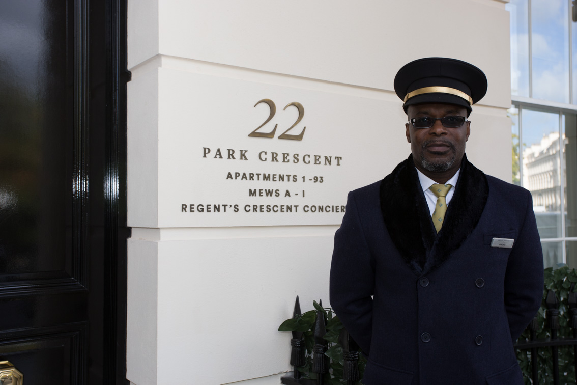
Permanent signage for the property development sector – internal and external wayfinding signage for this high-end, luxury development in Marylebone The Brief Regent’s Crescent in Marylebone was originally built in 1820 for the Prince Regent, later George IV. Designed by architect John Nash, it boasts grand proportions and a sweeping façade and is one of London’s great historical landmarks. The Grade I listed development consists of 67 apartment residences and nine garden villas, with interior design by Millier. Reade Signs won a competitive tender to manufacturer and install the internal and external wayfinding signs at Park Crescent, part of this high-end luxury development. The Solution The process began six months prior to installation, following acceptance of The Velvet Principle’s designs and our production costs. We worked in collaboration with the client team, which included a wayfinding consultant, architect, developer and designer. We start every large architectural project by producing a detailed schedule. This is used as a working document to reflect the changes to specification that occur during site surveys, meetings or in email dialogue. In our schedule, every sign is assigned a unique code, which can be cross-referenced with sign location plans. The document gives our clients piece of mind that we fully understand the design intent and we communicate this detail to all members of our design, manufacturing and installation teams. Alongside scheduling, we manufactured samples of each different sign type to provide a benchmark for agreed quality standards. Once samples and schedules were approved, we could commence manufacture and installation planning. The specification was for high-end materials to match those used throughout the fit-out. Each laser cut letter needed an antique brass finish to give the right patination and some of the signs were powder coated in a dark bronze. A jewellery-like quality was specified, so we hand-finished and polished each letter and number to achieve a burnished effect. During the installation process, we agreed the exact location for each sign with the architect. Some of these needed to be changed and fixings adapted due to textured wall finishing. We also sourced specialist tapes, which is an essential part of working in a listed building, since you can’t drill into the walls. We completed the installation of this permanent signage in phases to coordinate with the construction milestones. Although this was a complex project, it went very smoothly from start to finish. The team at Reade Signs were really easy to work with throughout and kept closely to the design intent to echo the craftsmanship and quality of the overall interior design from the outset. To match the high standards of this luxury development meant that hundreds of individual sign components had to be hand finished and polished. The internal and external wayfinding signs were manufactured and installed very efficiently, dovetailing with the main contractor’s delivery programme. Sean Brereton, Creative Director, The Velvet Principle The team has been really supportive and achieved the design intent we were aiming for. The finishes are really good which, along with the design, make the final product great! Valeria Doro, Associate Architect, Millier

Read More