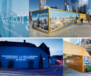
Business owners often neglect the importance of signage designs. Designing memorable signage is essential to attract the attention of prospective customers. One of the key purposes of signage is to draw the customers’ attention towards the product or service the business offers. Hence, if signage is hanging outside your business, it must serve its purpose well. The passers by must be immediately drawn towards the signage, and the design should provoke them to at least enter the store, if not make an impulse purchase decision.
Getting noticed is a major objective for every local business in particular, especially with the declining footfall in many high streets throughout the UK. Signage design is one string in the bow in the fight for customer attention.
3 Tips to Create Attractive and Memorable Signage
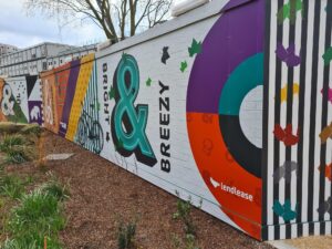
Use the Right set of Colours
Choice of colours plays a major role in magically transforming signage designs. An expert sign designer can generally advise on use of colours. For instance, bright colours like red, orange and yellow can be easily spotted and make the signage look bright. Pay heed to the psychology of colours. Consult with the designers and select a palette of colours that people will take to positively.
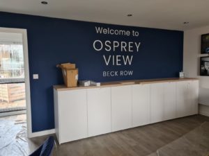
Simple and Readable Designs
Don’t crowd the signage design. It is a message that you want to convey. Keep the design simple so that it instantly reaches the target audience. Overly complex designs may not be easily read. Simple designs are easy to read, and everyone digest the information presented more easily. This clear and consistent communication can help a retail business gain more prospective customers. Also, good quality lighting for signage can ensure visibility around the clock. This will help attract the customers’ attention even from a distance and at night.
Large and Attractive Fonts
The message you want to convey must be written in big and bold fonts. Otherwise, the purpose of the design remains unfulfilled. Make sure that you use a bigger font size and one that is easy to decipher. The aim is to make the signage visible and readable from a distance, as well as up close. Avoid using flowery and designer font styles where possible. This might not be useful if you want to get your message conveyed at a glance.
Reade Signs specialises in delivering the best quality signage designs that can be used effectively for business purposes. To know more, check our website.