Reade Blog

Property

Reade Signs achieves Gold membership with Constructionline

Working in the property and construction sector, we need to maintain extremely high standards and ensure we adhere to health and safety regulations. We’re very pleased to say that we now have Gold membership status with Constructionline. The process of certification required validation checks using a pre-qualification questionnaire. Our credentials were assessed for environmental management, quality management, equal opportunities, modern slavery act adherence and anti-bribery and corruption policies. We were also assessed for SSIP and were ‘deemed to satisfy’ SSIP certificates for health and safety – something that all construction buyers look for in supplier selection. Existing clients also had to provide testimonials about the quality of our work. Please view our other accreditations here. For further information about our range of services for the property and construction industry, please get in touch on 01252 336000 or email enquiry@readesigns.com.

Read More
Architectural

Manufacture and installation of 400 wayfinding signs at the V&A

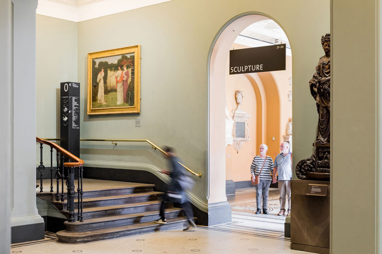
Image courtesy of Sam Bush and dn&co The V&A is the world’s leading museum of art and design, with a permanent collection of over 2.3 million objects. The Museum engaged award winning designers, dn&co to design a new wayfinding scheme. Developed in collaboration with allpointswest, the new system helps guide visitors through its vast 145 galleries, inviting them to explore the lesser-known parts of the museum collection.  Reade Signs won a competitive tender to supply the wayfinding signage for the entire scheme throughout this iconic building. The project was recently featured in Design Week, Creative Review and Wallpaper. Read the full case study.   As part of the project, we manufactured and installed over 400 directional signs made from Valchromat – a type of MDF. We selected this material because it’s uniquely dyed all the way through and cuts very well. The edges of all the sign panels were chamfered, so we needed a material that would give us a crisp cut. The signs were then faced with beautiful tulipwood veneers, which were dyed black. Tulipwood is pinkish yellowish wood, which is very light, but also very strong. This makes it a perfect choice for quality signage that will stand the test of time. The hanging signs had to be very light, due to the physical constraints of the building, so we used another unique material called Banova plywood. This is a material made from sheets of laminated balsa wood and is very strong and unbelievably light. These signs were also faced with dyed tulipwood veneer. When the Victoria and Albert Museum was founded in 1852, the buildings were intended to represent the best of contemporary architecture and design. Victorian parts of the building have a complex history, with additions made by different architects over the years. Many of the wall and ceiling materials were unknown to us, so we had to research and create multiple bespoke fixings that both protected the listed building and made it safe for visitors. Philippa Simpson, Director of Design, Estate and FuturePlan at the V&A said: “Installing wayfinding at the V&A was an ambitious and enormously complex undertaking, and relied on excellent communication and collaboration. Reade Signs were a pleasure to work with throughout, showing sensitivity to the demands of the Grade 1* listed building as well as a full understanding of the design intent. They were quick and innovative in proposing solutions to any challenges, and made sure any disruption to the day-to-day operations of the museum was kept to a minimum.” Philippa explains the V&A wayfinding project here. The finished wayfinding signage looks and fantastic and help visitors to make the most of their experience of this iconic and beautiful museum.  If you would like to find out more about our wayfinding signage, museum panels and interpretation board services for museums and heritage buildings or other wayfinding projects for public areas, please get in touch on 01252 336000 or email enquiry@readesigns.com. Image courtesy of Sam Bush and dn&co Image courtesy of Sam Bush and dn&co ImageImage courtesy of Sam Bush and dn&co courtesy of Sam Bush and dn&co All Images courtesy of Sam Bush and dn&co

Read More
Property

What’s the most impactful signage to help promote your new housing development?

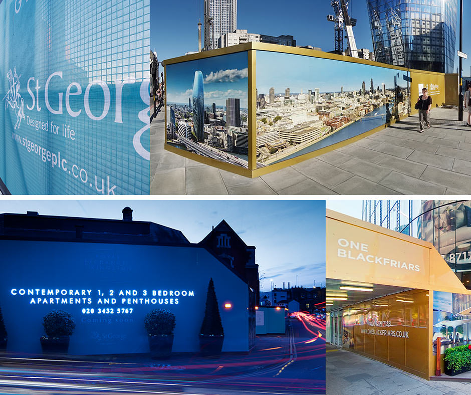
Over the years we’ve learnt a lot from our work in the property sector. We often get asked about the best site signage options to help new developments stand-out and the most effective ways to capture buyer interest from passing traffic. Head of key accounts, James Herbst, specialises in the property sector and here he identifies the six most effective types of signage and the things to consider for each option: 1.      Development site hoarding All building sites must have site hoarding to protect the site and the public. This is the best and most cost-effective form of advertising for the development. It provides a large space for advertising and is reasonably priced, compared to other types of advertising media. Printed ACM is the most popular means of installing graphics onto the hoarding structure and is also very effective in making the construction site more attractive – a big positive for local residents. There are several ways that hoarding graphics can be enhanced to accentuate certain messaging or branding, as well as provide night-time exposure too. This includes: Built-up 3D letters with LED internal illumination or halo illumination Lightboxes – either flush inlaid or surface mounted Reflective vinyl graphics Raised hoarding sections 3D or protruding elements Creative or unusual surface covering. Depending on budget, the site hoarding can be fully or partially clad. It’s vital to have a good understanding of the phasing of the development at design stage; taking a considered approach allows for flexibility with messaging or future project updates. 2.      Printed site banners Most developments will at some point have scaffold structures in place as the building progresses. The scaffold structure also provides a huge area for advertising or to mask the construction site. Printed banners can be fixed to the scaffold structure with a perimeter stand-off frame that will ensure an even, flat surface for a well-tensioned banner. Generally, a printed mesh PVC banner is the popular choice, but the readability is often compromised due to too much natural light from above or below. There are good, lightweight and solid PVC products that are better suited and don’t affect the wind-loading on the scaffold structure too much. It’s always a good idea to have discussions around banner requirements ahead of the scaffold structure being erected. We can then guide the scaffolder in designing the scaffold structure to be able to withstand the weight and wind-loading of the banner. The banner can be further enhanced with the addition of LED flood lights on projecting arms from the top and bottom. 3.      Site gates Due to the volume of traffic entering and exiting the site gates, branding on the gates can start to look tatty quite quickly. Hoarding contractors also often supply gates that are not designed to take the load of timber ply and printed ACM. Printed mesh banners are a good option in these instances, as this eliminates the weight concerns and is reasonably inexpensive to replace if it’s damaged by site traffic or becomes dirty. This ensures that the site entrances look neat for the duration of the build. 4.      Banners and flags These are a very effective and inexpensive way of branding a site. They are often used to direct people towards the sales and marketing suites, site entrances or strategically placed along the hoarding line at the rear. Lightweight aluminium poles are available off-the-shelf, which are already structurally calculated and are very easy to install, whether it’s being braced to the rear of the hoarding or planted into the ground with sleeves. It’s worthwhile getting the best quality flag as in windy and dusty conditions, the flags will need to be replaced from time to time. We recommend knitted polyester flags that are hemmed. The flags can drape, which gives a level of movement and animation as they blow in the wind. Alternatively, banner flags will ensure the flag retains its shape and that the logo and core marketing messages are always visible. There are several off-the-shelf options available in standard sizes and where there is a requirement for a larger banner or flag, bespoke steel-fixed arm banners can be produced. These are more expensive and harder to install due to the increased weight but are very effective and can be re-used on future developments. 5.      Gantry signs, totems and monoliths These signs are suited for sales and marketing suites and will usually be bespoke. Using this type of signage would very much depend on the timeline of the development and available budget. Printed ACM panels are a great low-cost option and these types of signs have steel or aluminium posts or frames, which can either be planted in the ground with sleeves or secured with post mix. For the larger signs, you may need a concrete foundation, including a ground cage. In all instances it’s advisable to ensure that there are structural drawings and engineer’s calculations in place to maintain the integrity of these signs. Sizing and positioning will be very much site specific and you should consider factors such as viewing distance and any obstructions like trees, lamp posts and landscaping. These signs can be enhanced with the addition of 3D elements, back-lit logos and text, feature lighting or even up-lighting and down-lighting with the use of LED spotlights. 6.      Façade and building signage This signage is used for marketing and sales suites and the client’s marketing team would generally have considered the inclusion of any external signage in the suite’s design. We can provide expertise regarding material specification that would best show off the brand. The choice of materials will completely depend on the design and could be anything from ACM and stainless steel to aluminium and acrylics. Once installed, Reade Signs provides a maintenance service throughout the lifecycle of the build and we also offer responsible recycling of signage materials too. If you’d like to find out more about what signage would have the biggest impact for your new property development, please get in touch with Joanna on

Read More
Property

What are the most effective marketing channels to achieve footfall for your marketing suite?

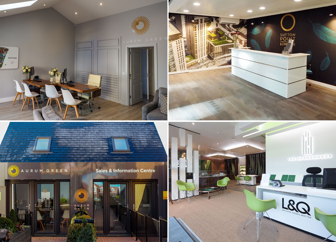
The days of the deals-on-wheels style portacabin as a place for negotiations have well and truly vanished. And the property industry is leading the way in developing beautifully designed marketing and sales suites to create a customer experience that reflects a new housing or apartment development. Developers are essentially selling a lifestyle and to do this, they need to make their customers feel special. Marketing suites play an essential role in communicating the look and feel of a finished site; ensuring all touchpoints are spot-on by creating an immersive and interactive experience. They can also incorporate show apartments, 3D models, private meeting rooms, refreshment areas and closing rooms. An effective marketing suite makes potential buyers feel a connection to the development and its surrounding environment, as well as gaining trust in the developer and their service levels. We recently conducted our annual customer satisfaction survey; essential to us to ensure our reputation and service levels remain strong. Our customers include nationwide and local property developers, housing associations, construction companies and creative agencies. As part of the survey, we also asked them to share insights into the channels that achieved the most footfall to their marketing suites. Here are the top three results: Online and signage top the charts First – Website (29%)Second – External signage (24%)Joint Third – Hoarding and Social media (both 17%) The top spot isn’t entirely surprising, since we’re naturally used to interacting with digital technology for research and other practical purposes. Marketing focus is now, crucially, targeted at digital channels and making sure your website and social media channels are optimised and regularly updated is critical to maximise conversion rates. It’s also interesting (and of course pleasing to us!) that one of the oldest forms of marketing – signage – is still considered vital in prompting the desired audience action… getting people through the door of your selling space. It shows that offline brand touchpoints are just as important when creating a marketing strategy across multiple channels. If you’d like to find out more about creating a great customer journey, please visit our marketing suite page, our site signage page or our site hoarding page. If you’d like to discuss a project, please get in touch on 01252 336000 or email enquiry@readesigns.com.

Read More
Marketing Suites
Property

Five steps to the perfect marketing suite

Most new developments will require a dedicated marketing and sales space in which to engage with potential buyers. A marketing suite is your showroom – possibly even before you even have anything to show. We know that creating the perfect environment and optimising selling space is central to generating more leads for a new development, so we’ve put together our top five steps to creating a relaxed and comfortable environment for prospective buyers: 1. Start with the customer journey – during the planning phase, carefully consider how you’ll lead potential buyers through to your marketing suite. Elements like clear external signage and hoarding, the path around the site, inviting directional signage, a convenient car park, external lighting and landscaping can all be used to lead people in. Once inside, incorporate a reception and refreshment area with development models, interactive displays and brochures. When people are further along in the customer journey, they’ll want to view finishes, such as kitchens, carpets and tiles to get a taster of the style of the development and help them in their selection, so make sure you include space for this. Consider the route you’ll take to get people to the show house or apartment when it’s ready – this needs to be just as appealing to make sure they don’t feel like they’re stumbling through a building site. Finally, make sure you have an appropriate space in which final negotiations can take place. 2. Showcase the development’s brand – for a great first impression, the interior décor must be warm and comfortable – as well as an attractive and aspirational environment – to appeal directly to your demographic. Whether the finish of your marketing suite is luxury or affordable, or has quirky or traditional styling, will depend on the target audience. To maintain brand consistency, the choice of elements like furniture and technology should also reflect the development. 3. Tell your story – alongside your website, a marketing suite is a crucial tool in telling your development’s brand story. Make sure you do this with clarity and consistency. Intrigue the audience with informative wall graphics, interactive displays with CGI images, or a 3D development model to answer key considerations. You’ll need to communicate information like: the size of properties, how many are available, what the site plans look like, how far the nearest station is, what schools are in the area, the selling points of local amenities and restaurants, the development story, or the history of the area. 4. Function as well as form – marketing suites aren’t always the largest spaces, so don’t forget about practical considerations to working effectively. If your sales team has a good experience of working in the space, this will translate to buyers. Avoid clutter with built-in storage for bags or brochures. Think about formal and informal areas – you may need a relaxed seating area, as well as a private room for sales negotiation. Keep staff facilities, like the cloakroom, kitchen or toilet out of sight. You should also provide hi-vis jackets and hard hats and keep them in a tidy area. 5. Meticulous project management – working on a live construction site is not always easy, so excellent project management will be key to the success of your marketing suite build. Depending on the size and scope of the marketing suite and fit-out, from instruction to design, survey, artwork, production and installation can take anything from three weeks to six months. A good project manager will build strong relationships with the site and construction teams and maintain clear channels of communication. This will be a public space within a building site, so make sure you work with a company that adheres to strict health and safety guidance for peace of mind. Finally, it’s important to choose a consultative partner you can trust to find practical and cost-effective solutions to any issues that occur – rather than promise you they won’t happen in the first place. Reade Signs project manages the design and build of marketing suites to help customers visualise their new home. We do this for leading housing associations and property development companies – both one-off projects or nationwide roll-outs. Please visit our dedicated marketing suite page if you’d like to find out more. If you’d like to discuss a project, please call us on 01252 336000

Read More
Property

How to make an impact with extra height hoarding

Extra height site hoarding is a great way to help your new development stand out on a busy street.  Each standard site hoarding panel is 1220mm x 2440mm. However, adding height at high footfall points and corners is a great way of achieving additional stand-out, especially alongside flagpoles and gantry signs. Using materials like Foamex to extend the canvas of the hoarding up to double height really helps to highlight messages above daily traffic and is very cost-effective. Make sure you consider factors such as health and safety, wind loading and structural calculations. If you’d like to find out more about extra height building site hoarding and any considerations that need to be taken into account, please call us for a chat on 01252 336 000.

Read More
Property

Eight steps to getting your development noticed

When it comes to marketing a new development, it’s important that signage needs are considered as early as possible to really help improve stand-out, get noticed and deliver the wow factor. A complete signage service starts with an initial idea and ends with a safe and timely installation that sends the right message through design, quality and functionality. We want to make sure you have the most impactful signage to help promote your new housing development. Here we outline our tried and tested eight-stage process from idea to installation:  1. Initial briefing The first stage of the process is crucial for ensuring a successful project. Our team visits the site to find out exactly what’s required, understand the surrounding environment and the target audience. The visit covers signage locations, substrates and ground conditions for posts and footings and accurate measurements to confirm signage dimensions. The type of sites we work on are very diverse, so we also consider elements like anti-graffiti finishes in a city centre or wind-loading calculations on an exposed rural site. Sometimes we’re sent a client’s sketches or designs, but a site visit gives us a real feel for the project, potential limitations or opportunities and sparks ideas about which materials and formats to use. 2. Developing the concept Once we have the brief, we can recommend processes and technology to complement the project and engage the target audience. Our in-house studio works with clients directly and we also regularly collaborate with designers to bring their design to live, throughout the whole project lifecycle. A preview of the concept is created, entirely to scale, so that proximity, heights, colour schemes and all necessary details can be viewed. Next, is the fun part of selecting the right materials for the project based on suitability, within the limits of the budget. The technical knowledge of our team means we can often propose more cost-effective or innovative materials that offer the same durability and appearance as the client’s suggested option. Structural integrity is also very important; stronger materials are needed for large external signs to ensure only suitable materials are used for any job. At this point a quote is generated, itemising every detail of size and material used to enable informed decisions that achieve the right overall effect at the right price. 3. Site or technical survey Once the design and quote have been accepted, for large-scale signage projects, a full survey of the location is conducted to ensure the final design fits the characteristics of the landscape and the purpose. At this point, adaptations can be made in the designs to take the terrain into account; if hoarding has to be installed on a slope, for example, the design will have to be tiered. Simple projects don’t require surveys, but if signs are being fitted at height, or access equipment such as a cherry-picker is needed, then a technical survey will highlight any issues that may not have arisen during the site visit. Issues can include: accessibility, power supply, terrain, vehicle access and the structural integrity of the building supporting the sign. Measurements can also be checked for high level signage. At this point, site health and safety requirements such as inductions, parking or special permits for the installation team are also confirmed. 4. Design and prototype We create a 2D colour visual of the design for the client to approve layout, colours and materials for the signage. For more complex, technical projects we also use high quality graphic visualisation software to produce 3D visuals and engineering drawings. These are also suitable for planning permission applications and can be used to address health and safety concerns. We can even make planning applications on clients’ behalf if needed. It’s important that marketing communications for a new development or branding within a sales and marketing suite are aligned to the client’s brand and messaging. So, a 3D virtual representation brings ideas to life and gives all parties involved in the final project a sense of the bigger picture so that they can work together towards an agreed result. 5. The proof A PDF proof for client approval is always sent before the manufacturing process begins. These are drawings that contain all dimensions, materials and sometimes an annotated image of the installation location. Once approved, a project manager will issue the job to our factory to start making the signage. 6. Manufacture Signage can be manufactured from a huge range of materials, depending on their qualities and what the client needs it to do. Whether it’s timber, metal, plastic, Dibond or aluminium composite material (ACM), vinyl or laminate, our team will consider the most appropriate materials to suit the conditions at a specific location and bring architectural designs to life. Metal is a versatile material, combining strength and longevity with flexibility, creating a multitude of shapes and sizes. Available finishes also offer a variety of visual effects; polishing, painting, spraying or powder coating. Timber has traditionally been used as a signage component to convey a rustic look, but we also use faux timber to achieve the same heritage look, at a lower price and with better longevity. Aluminium, brass, plastics, laminates, wood and even polystyrene can be incorporated into a design to give it the right look and feel. Our skilled in-house staff use cutting-edge machinery and technology to construct signs that match client requirements. Designs are applied using powerful LED technology to meet the growing demand for higher quality and quick turnaround, better resolution and multilayer printing. In-house machinery is used for all cutting, no matter the material. We can even create a 3D effect to help a sign really stand out. Printed hoardings and interiors allow flexibility for changing colours and designs quickly and easily, to match seasons or to advertise special promotions. All hoardings are made using weather-proof materials and coated with anti-graffiti seals to make them last longer. 7. Installation Reade Signs manages the entire installation process using our own team, who have the experience to ensure signs

Read More
construction site hoarding
Property

Top ten site hoarding design tips

When it comes to advertising hoarding, simple messaging and bold design is the key to attracting attention and generating enquiries. We’ve put together our top ten site hoarding design tips to help you maximise awareness of your new development and boost visits to your marketing suite: 1. Establish a budget – this will help to guide your creative team from the outset and means your designers can tailor the hoarding design to make the most of your budget. It’s also important to consider which cladding you’ll use to reflect your development. Dibond cladding is ideal for most developments and vinyl wrapped ply is excellent if you want to achieve a more polished look. 2. Site survey – to make sure the hoarding fits in well with the surroundings, we recommend you have a site survey. This will consider gradients and permanent elements, using exact measurements that can be built into the design: you don’t want a web address obscured by a post box, and any horizontal designs might look messy on a hill. Make sure your survey also incorporates factors such as health and safety, wind loading and structural calculations. 3. Consider the target market – awareness of the target audience for your development will guide any imagery and graphics you select to represent your brand and help them visualise themselves in their potential new home. 4. Less is more – your key messages should pop out of the hoarding from a distance, so it’s important not to clutter hoarding and leave some space. Great images will support your brand and make sure you include key contact information and a call to action. You will need to convey messages in seconds, especially if people are driving past. 5. Brand consistency – keep hoarding design consistent with other channels and marketing, such as site signage, flags, gantry signs, your marketing suite, website or advertising. 6. Keep it fresh – refresh hoarding periodically with bold colour changes to emphasise development phases, such as plots reserved, or sales achieved. Make sure it’s kept well maintained and repaired if it suffers any damage. 7. 24/7 advertising – consider day and night-time passing traffic – both on foot or in vehicles – and make sure your hoarding design works hard at all hours and drives people to your website and marketing suite. Header and kicker LEDs can help this, as can lightboxes that showcase the décor. 8. Spotlight your logo – whether you’re a national developer or specialise in high-end bespoke builds, you need to make sure your logo is at the right scale to aid recall. As part of the design, you may consider having your logo in illuminated letters or a light box, both of which are very striking. 9. Sell the location – being sympathetic to the local area and considering the surrounding buildings when designing your hoarding is also important. Complimenting the neighborhood through your creative – whether the development is in an urban location or set within a historical market town – can help to sell what’s unique and attractive about the area. 10. Reach for the sky – standard site hoarding panels are 1220mm x 2440mm. But within your design it’s worth considering adding height at high footfall points and corners – a great way of achieving additional stand-out, especially alongside flagpoles and gantry signs. If you’d like to find out more, we have a dedicated page about building site hoarding. Please call us for a chat if you’d like to discuss a project on 01252 336 000. 

Read More
Company News

From paintbrushes and ply: the evolution of a signage company

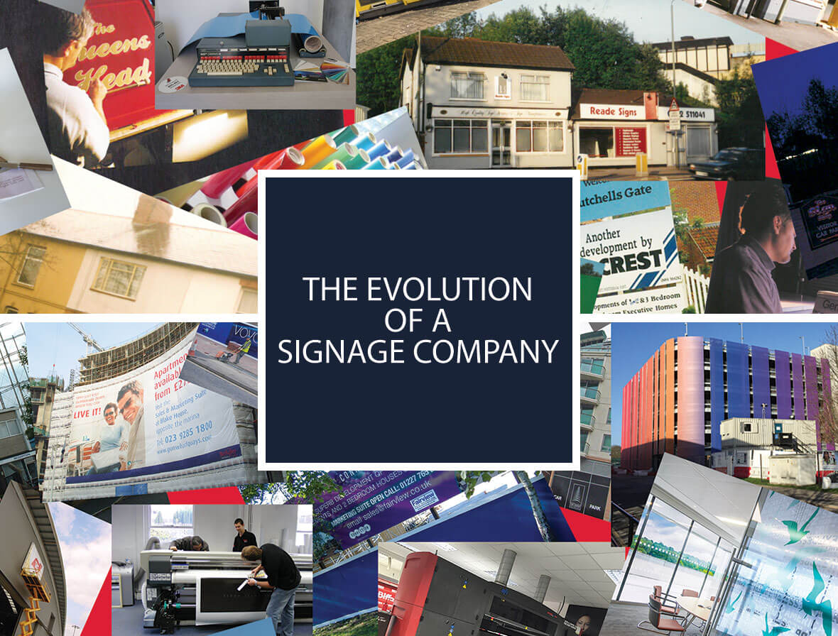
Since Reade Signs was founded in 1980, the once time-intensive craft of sign writing has changed beyond recognition. Hand-made signs have morphed into large-format branded graphics produced using the latest printing technology. Hand tooling has been replaced by CNC machines. And health and safety requirements mean ladders are out and cherry pickers are in. Here, we look back at the early days of Reade Signs and reflect on what has – and hasn’t – changed about the signage industry. £100 and a few tins of paint Andy Reade, CEO, founded Reade Signs from his spare bedroom with £100, a few tins of paint and a couple of sheets of plywood. After leaving school he became an apprentice sign writer for a local one-man-band sign company, eventually moving to the Royal Aircraft Establishment in Farnborough. A lack of fulfilling work spurred Andy into action and he started to take extra jobs at the weekends and evenings, soon building a customer base and eventually setting up on his own. Sign writing is a true skill. In the early days, Andy hand-painted timber signs, shop front fascia signs, vehicles and all types of different surfaces, including glass, painted timber and metal using specialist paints and traditional techniques. There were cut vinyl letter systems available, but back in the 1980s, these systems were basic with limited fonts and slow production times. However, the systems improved quickly, and the writing was literally on the wall for hand painted signage as a mass production method. During the first three years, Andy moved from back-bedroom to garden workshop crafting signs for shop fronts, vehicles, job boards, builders and pubs – enjoying the variety of jobs and clients. As the business grew, Andy took on an apprentice himself and after ten years, Reade Signs moved to its first premises in Ash Vale, followed by several more moves as the business quickly expanded. Roots and wings It was during this time that Andy Fergus Smith joined, bringing a complementary set of skills to the team to help the company grow. Originally a graphic designer, he ran his own screen print business for 12 years before joining Reade Signs in 2002 as production manager. He was involved in graphic design, account management, operational and general management before becoming Director and shareholder in 2008. In 2003, Reade Signs moved to its current two-floor office space and factory at Holder Road in Aldershot. At the time there were 15 employees, and this has now grown to over 40; with specialist teams bringing wide-ranging skills, qualifications and knowledge and including some loyal, long-standing employees and members of the Reade family. Rapid developments in technology meant that sign writing evolved and expanded. The lines blurred between print and sign making and the possibilities for large format outdoor graphics to suit all budgets opened up new markets for sign makers. Full colour, photographic printing onto vinyl was a real breakthrough. All of a sudden you’d see images on vehicles, building site hoardings and temporary banners, where previously it would have been prohibitively expensive to have graphics on these platforms. Direct-to-media flatbed printers marked the next step enabling bigger, faster and higher quality printing onto substrates as diverse as ply and glass. Reade Signs invested in direct-to-media technology in the mid noughties and as the company continued to grow, so did the size of the clients. It was the booming property sector that Reade Signs really gained expertise in and today site signage, hoarding, marketing suites and directional signage remain at the core of our offering. The signage industry – what’s changed 1. Signage rebranded The signage industry has changed beyond recognition and the terminology used has had a bit of a rebrand in recent years; signage is now seen as a core channel in the marketing mix and an important part of achieving brand consistency. Knowledge of marketing and brands is vital to understand unique brand requirements and innovate. It’s frequently referred to as large scale brand implementation, brand activation, wayfinding or large format branding… or just plain signage. 2. Super graphics Sign making has always been a craft, but in terms of scale, the industry has blossomed. There are very few screen printers and only a handful of artisan sign writers today; work centres more around implementation and management of projects, with multiple stakeholders and suppliers. From local beginnings, clients now come from all over the country. A baffling array of different formats are available for all types of signage, banners, hoarding, events and exhibition graphics, retail branding, vehicle graphics and marketing suites. Professional, quality signage is now available to any organisation and to suit any budget. The art of sign-making still requires a specialist skill-set, but the skills needed are very different. 3. Specialists – all under one roof Over the years, as sign requirements reached a larger scale, a finished sign would require several specialists at different points throughout the process. You’d get the signage artwork agreed, then go to a sign writer, then an artist for the pictorial part, then you might go to a screen printer.  Now, technology and an expert in-house team means this is all under one roof. We have a large pool of skills, qualifications and knowledge from a team expert at quoting, sourcing and project managing to meet client demands and be increasingly competitive. 4. Choice and demands As larger companies and brands realised the importance of making a splash with signage, expectations become higher and lead times got shorter. Reade Signs now works with so many more materials – it’s not just ply and paint – there are hundreds of materials that can create different effects to represent a brand and grab the audience’s attention. It used to take weeks to apply undercoat, paint the ply, route-out posts – it was all quite laborious.  But now, full colour capabilities mean we have no constraints – we can print onto almost any material. Last year we produced six miles of panels for property developers, handled
Read More
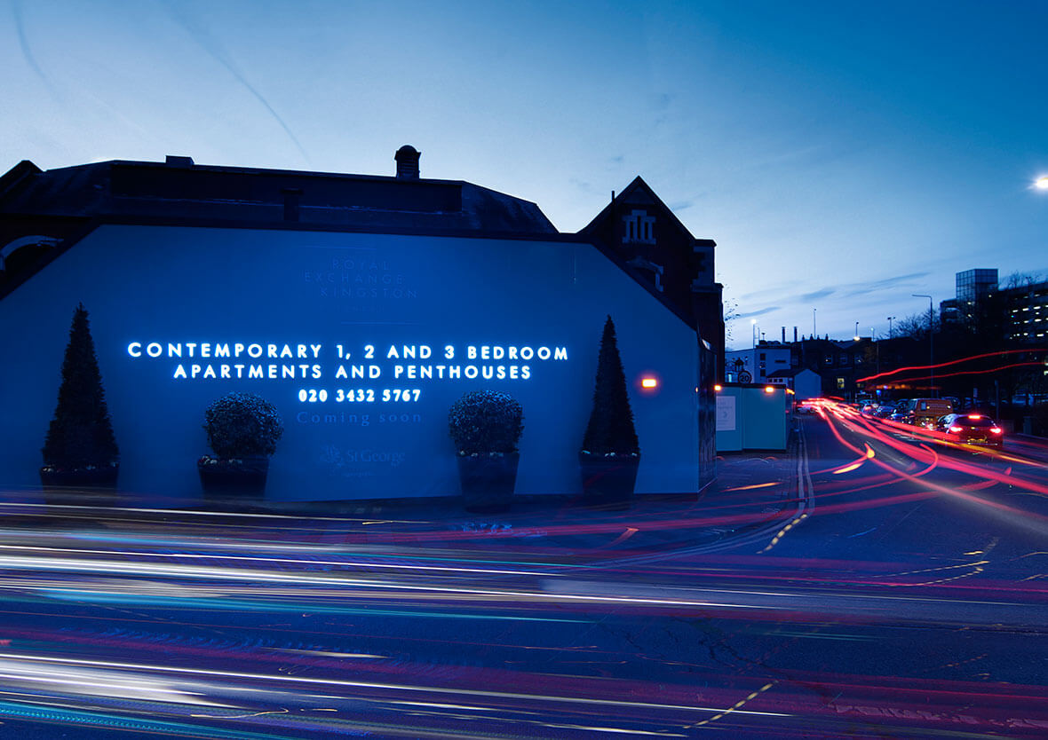
Sign installation at Royal Exchange, Kingston-Upon-Thames
Property

How can I use lighting with my site hoarding?

Clever use of hoarding lighting is a superb way of making the most of the best vantage points, highlighting messages and maximising the impact of your site hoarding. With one in eight people working night shifts, and darker winter months, great lighting means you can make the most of your marketing 24/7 for all passing traffic. Lighting elements include lightboxes, strip lighting and halo-illuminated lettering. LEDs are available in many variations and can be used with timers in sensitive residential areas, also making it more cost-effective. LED header and footer hoarding illumination is low cost, great as a design feature and provides a subtle wash of light rather than illuminating the entire hoarding. Halo-illuminated lettering is great for highlighting your new development name or brand. Lightboxes used within hoarding can be very effective. The use of shallow lightbox extrusion and printed flex-face panels mean the hoarding can take extra weight without compromising the structure. We always recommend getting the structure of the hoarding checked by a qualified engineer before adding any additional weight to it, such as light boxes, flagpoles or extended height sections as these all add extra wind loading to the hoarding. All these elements help draw attention to your advertising hoarding messages all year round and, if correctly designed, are very cost-effective. If you’d like to find out more about how lighting can enhance your building site hoarding, please call us for a chat or if you’d like to discuss a project on 01252 336 000.

Read More